Category Archives: Data Analysis

Data Analysis

Mean Median Mode Range Meaning | Measures of Central Tendency Understanding, Examples, and Formulas
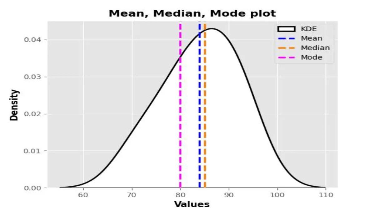
Table of Contents

Introduction

Measures of Central Tendency, encompassing Mean Median Mode Range Meaning, stand as indispensable tools in statistical analysis, providing vital insights into the central tendencies and variability of datasets. From exploring the Range in Mean Median Mode to understanding the Meaning of Mean in Math, these measures offer a comprehensive framework for analyzing data across diverse fields. Whether deciphering financial trends, healthcare outcomes, or scientific phenomena, a profound understanding of Measures of Central Tendency is essential for effective data analysis. By delving into these concepts, researchers and analysts can navigate through complex datasets, unveil underlying patterns, and make informed decisions, thereby driving impactful outcomes in their respective domains.

Mean Median mode Range Meaning

In statistics, the Mean Median mode Range means essential measures of central tendency used to summarize and analyze data. The focal point or standard measure is where data points are inclined to be gathered. They are indispensable in statistics, offering a condensed representation of data distribution. The primary types of central tendency measures include the mean, median, and mode. These measures provide insights into the central tendencies and variability of a dataset, helping researchers and analysts draw meaningful conclusions. Understanding the meanings and applications of mean, median, mode, and range is crucial for effective data analysis across various fields

Meaning of Mean in Math

The meaning of mean in math refers to the average value of a set of numbers. It stands as a frequently employed metric for central tendency within statistical analysis. The mean is calculated by adding up all the numbers in a dataset and then dividing the sum by the total number of values. This calculation provides a single value that represents the typical value of the dataset.

For example, suppose we have a set of numbers: 10, 15, 20, 25, and 30. To find the mean of these numbers, we add them together: 10 + 15 + 20 + 25 + 30 = 100. Then, we divide the sum by the total number of values in the dataset, which is 5. So, the mean is 100 divided by 5, which equals 20.

In this example, the mean of the dataset is 20. This means that if we were to choose one number that represents the average value of the dataset, it would be 20. The mean provides a way to summarize a set of numbers and understand their measures of central tendency. It is widely used in various fields, including mathematics, economics, science, and engineering, to analyze and interpret data.

Meaning of Median in Math

In the meaning of median in math refers to the middle value of a dataset when the values are arranged in ascending or descending order. It is a measure of central tendency that divides the dataset into two equal halves, with half of the values lying below the median and half lying above it.

To find the median of a dataset, you first arrange the values in numerical order. When the dataset contains an odd quantity of values, the median corresponds straightforwardly to the value situated in the middle. For example, consider the dataset: 10, 15, 20, 25, 30. When arranged in ascending order, the middle value is 20, so the median is 20.

When the dataset comprises an even quantity of values, the median is calculated as the mean of the two central values. For example, consider the dataset: 10, 15, 20, 25, 30, 35. When arranged in ascending order, the two middle values are 20 and 25. The median is the average of these two values, which is (20 + 25) / 2 = 22.5.

The median provides a measure of central tendency that is less influenced by extreme values or outliers compared to the mean. It is commonly used in statistics and data analysis to describe the typical value of a dataset and understand its distribution.

Meaning of Mode in Math

In meaning of mode in math refers to the value that appears most frequently in a dataset. It is a measure of central tendency that helps identify the most common value or values in a set of data.

To find the mode of a dataset, you simply identify the value or values that occur with the highest frequency. For example, consider the dataset: 10, 15, 20, 15, 25, 30, 15. In this dataset, the value 15 appears three times, which is more frequently than any other value. Hence, the most frequent value within this dataset is determined to be 15.

It’s important to note that a dataset can have one mode, multiple modes, or no mode at all. If every value in the dataset occurs with the same frequency, the dataset is said to be “unimodal,” meaning it has one mode. If there are two or more values that occur with the same highest frequency, the dataset is “bimodal” or “multimodal,” respectively. If no value repeats or all values occur with equal frequency, the dataset has no mode.

The mode is a useful measure of central tendency, especially in datasets with categorical or discrete numerical values. It helps describe the most common value or values in a dataset and provides insights into its distribution.

Meaning of Range in Math

In meaning of range in math refers to the difference between the highest and lowest values in a dataset or set of numbers. It provides a measure of the extent of variation or spread within the data.

To find the range, one can derive it by subtracting the smallest value from the largest value present in the dataset. For example, if you have the numbers 5, 8, 12, 15, and 20, the range would be calculated as follows:

Range = Largest value – Smallest value

       = 20 – 5

       = 15

So, in this example, the range is 15.

The range is a basic measure of dispersion that helps to understand how much the values in a dataset differ from each other. A larger range indicates greater variability among the data points, while a smaller range suggests more consistency or uniformity.

While the range provides a simple and intuitive measure of spread, it may not always capture the full picture of variability, especially if there are outliers or extreme values present. In such cases, other measures of spread, such as the interquartile range or standard deviation, may be used for a more comprehensive analysis.

Differences and Relationships Between Mean, Median, Mode, and Range

While mean, median, mode, and range serve distinct purposes, they are interconnected and collectively offer a comprehensive overview of data distribution. Understanding their differences and relationships is crucial for effective data analysis and interpretation. For instance, in a symmetric distribution, the mean, median, and mode are all equal, while in skewed distributions, they differ.

Importance of Mean, Median, Mode, and Range in Statistics

Mean, median, mode, and range play vital roles in summarizing and analyzing data across various fields, including finance, economics, healthcare, and research. They provide valuable insights into central tendencies, variability, and distribution patterns, aiding decision-making and problem-solving. For example, in finance, these measures are used to analyze stock market trends and investment returns

Descriptive analysis in statistics

Descriptive analysis in statistics serves as a foundational methodology for elucidating the fundamental characteristics of datasets. It employs rigorous statistical techniques to quantitatively summarize and interpret raw data, facilitating the exploration of central tendencies, dispersion, and distributional properties. Through the calculation of measures such as means, standard deviations, and percentiles, descriptive analysis provides researchers with essential insights into the inherent variability and structure of the data.

Furthermore, graphical representations such as histograms, box plots, and scatter plots offer visual depictions of data distributions and relationships, aiding in the identification of patterns and outliers. In scientific inquiry, descriptive analysis plays a crucial role in hypothesis generation, experimental design, and exploratory data analysis, laying the groundwork for subsequent inferential and predictive analyses.

Measures of Central Tendency

Central tendency measures serve as essential statistical tools used to identify the most typical or representative value in a dataset. They play a pivotal role in summarizing data, aiding in analysis, decision-making, and drawing meaningful insights. In this comprehensive guide, we’ll explore the nuances of measures of central tendency, including their types, calculations, applications, and challenges.

Introduction to Measures of Central Tendency

Central tendency measures, as their name implies, offer an understanding of the central or typical value towards which data points tend to converge. They are indispensable in statistics, offering a condensed representation of data distribution. The primary types of central tendency measures include the mean, median, and mode.

Comparing Measures of Central Tendency

Every measure of central tendency possesses its own set of advantages and disadvantages. While the mean provides a precise estimate, it is sensitive to outliers, making it less reliable in skewed distributions. The median, on the other hand, is robust to outliers but may not accurately represent the central tendency in certain cases. The mode is useful for identifying the most common value but may not exist or be unique in every dataset.

Importance in Data Analysis

Central tendency measures play a crucial role in data analysis, providing insights into the central value around which data points cluster. They aid in decision-making, trend analysis, and hypothesis testing, guiding researchers and practitioners in understanding underlying patterns.

Impact of Outliers

Outliers, or extreme values, can significantly influence central tendency measures, particularly the mean. While the median and mode are more resistant to outliers, their presence can still skew the results and affect the interpretation of data. For example, consider a dataset of monthly incomes where a few individuals earn exceptionally high salaries. In such cases, the mean income would be inflated, giving a misleading representation of the average income.

Advantages of Using Central Tendency Measures

Central tendency measures simplify complex datasets, making them easier to interpret and compare. They provide a single value that summarizes the entire dataset, facilitating quick insights and decision-making. Moreover, central tendency measures provide a standardized way of representing data, allowing for meaningful comparisons across different groups or time periods.

Best Practices for Choosing the Right Measure

When selecting a central tendencies measure, it is essential to consider the data’s distribution and characteristics. Understanding the context of the analysis and the intended use of the results can help in choosing the most appropriate measure for a given dataset. For instance, when dealing with symmetrically distributed data without outliers, the mean may be the most suitable measure. However, if the data is skewed or contains outliers, the median or mode may provide a more accurate representation of the central tendency.

Central Tendencies: Understanding the Core of Data Analysis

Central tendencies, in statistics, are essential measures that provide insights into the central or typical value around which a dataset is distributed. They offer a summary of data distribution and are crucial for making informed decisions, drawing conclusions, and understanding the characteristics of a dataset. In this comprehensive exploration, we will delve deeper into the concept of central tendencies, including their types, calculations, applications, and significance in data analysis.

The formula for Mean Median Mode and Range

Statistics, an essential facet of mathematics, serves as a pivotal tool across numerous disciplines, influencing realms ranging from science and economics to the everyday dynamics of decision-making. Among the basic statistical concepts, understanding measures of central tendency is paramount. These measures include mean, median, mode, and range, which help in summarizing a dataset and understanding its central behavior.

Mean Formula

Mean

The term Mean in mathematics typically refers to the average of a set of numbers. The equation for computing the mean, also known as the average, is as follows:

The mean is calculated by dividing the sum of all numbers by the total count of numbers.

\[\displaystyle Mean=(\sum{X})/n\]

where:

\[\displaystyle \sum{{X,denotes\text{ }the\text{ }total\text{ }accumulation\text{ }of\text{ }every\text{ }numerical\text{ }value\text{ }within\text{ }the\text{ }given\text{ }set}}\]

\[\displaystyle n,denotes\text{ }the\text{ }total\text{ }count\text{ }of\text{ }numbers\text{ }within\text{ }the\text{ }set.\]

For the Mean (average), we use the formula: 5, 7, 9, 11, 13.

To find the mean (average) of these numbers, we’ll first add them all together:

\[\displaystyle Mean=5+7+9+11+13=45\]

\[\displaystyle Mean=\frac{{45}}{5}\]

\[\displaystyle Mean=9\]

Sample Mean

\[\displaystyle The\text{ }formula\text{ }to\text{ }calculate\text{ }the\text{ }sample\text{ }mean,\text{ }denoted\text{ }as\text{ }~\overline{x},\text{ }is:\]

\[\displaystyle \overline{x}=\frac{{\sum\nolimits_{{i=1}}^{n}{{xi}}}}{n}\]

Where:

\[\displaystyle \overline{x}~~,represents\text{ }the\text{ }sample\text{ }mean.\]

\[\displaystyle {{x}_{i}}~,represents\text{ }each\text{ }individual\text{ }value\text{ }in\text{ }the\text{ }sample.\]

\[\displaystyle n~~,is\text{ }the\text{ }total\text{ }number\text{ }of\text{ }values\text{ }in\text{ }the\text{ }sample.\]

\[\displaystyle \sum{{~,}}denotes\text{ }the\text{ }summation\text{ }of\text{ }all\text{ }the\text{ }values.\]

Example scores in a sample: 85, 90, 78, 95, 88

For the sample mean (average), we use the formula:

\[\displaystyle \overline{x}~=\frac{{85+90+78+95+88}}{5}\]

\[\displaystyle \overline{x}~=\frac{{436}}{5}\]

\[\displaystyle \overline{x}~=87.2\]

The sample mean (average) of the test scores is 87.2

Population Mean

\[\displaystyle The\text{ }formula\text{ }to\text{ }calculate\text{ }the\text{ }population\text{ }mean,\text{ }denoted\text{ }as~\mu ~,\text{ }is:\]

\[\displaystyle \mu =\frac{{\sum\nolimits_{{i=1}}^{N}{{xi}}}}{N}\]

Where:

\[\displaystyle \mu \text{ },represents\text{ }the\text{ }population\text{ }mean.\]

\[\displaystyle {{x}_{i}}\text{ },represents\text{ }each\text{ }individual\text{ }value\text{ }in\text{ }the\text{ }sample.\]

\[\displaystyle N\text{ },signifies\text{ }the\text{ }complete\text{ }count\text{ }\left( {total\text{ }number} \right)\text{ }of\text{ }values\text{ }within\text{ }the\text{ }sample.\]

\[\displaystyle \sum{{\text{ },denotes\text{ }the\text{ }summation\text{ }of\text{ }all\text{ }the\text{ }values.}}\]

Example scores in a population: 85, 90, 78, 95, 88

Population Mean(average), we use the formula:

\[\displaystyle \mu =\frac{{85+90+78+95+88}}{5}\]

\[\displaystyle \mu =\frac{{436}}{5}\]

\[\displaystyle \mu =87.2\]

\[\displaystyle Population\text{ }mean\text{ }\left( {average} \right)\text{ }of\text{ }the\text{ }test\text{ }scores\text{ }is~\mathbf{87}.\mathbf{2}\]

Median Formula

For an odd number of observations:

\[\displaystyle Median=Middle\text{ }Value\]

\[\displaystyle Median=Value\left( {\frac{{n+1}}{2}} \right)\]

For an even number of observations:

\[\displaystyle Median=\frac{{Value\left( {\frac{n}{2}} \right)+Value\left( {\frac{n}{2}+1} \right)}}{2}\]

1. For Odd Number of Observations:

When the dataset contains an uneven count of observations, the median corresponds to the central value. For example, consider the dataset: 10, 15, 20, 25, 30. The median here is 20, as it lies in the middle when the data is arranged in ascending order.

2. For Even Number of Observations:

In cases where the dataset consists of an even number of observations, the median is determined by calculating the average of the two middle values. For instance, let’s examine the dataset: 10, 15, 20, 25. Here, the two middle values are 15 and 20. So, the median is (15 + 20) / 2 = 17.5.

Mode Formula

The Mode can be calculated using a straightforward formula:

\[\displaystyle Mode=Value\text{ }with\text{ }the\text{ }highest\text{ }frequency\]

Take into account the subsequent collection of values: 2, 3, 4, 4, 5, 5, 5, 6, 6, 6, 6. Here, the mode is 6, as it appears most frequently.

In a dataset like: 10, 15, 20, 25, 30, 35, 40, 40, 40, 45, the mode is 40, as it has the highest frequency.

Range Formula

The Range can be calculated using a formula:

\[\displaystyle Range(X)=Max(X)-Min(X)\]

Range in Mean Median Mode

Within statistical analysis, Range in Mean Median Mode serve as measures of central tendency, offering valuable insights into the typical values within a dataset. While these measures offer valuable information, understanding the range is equally crucial. Range signifies the spread or variability of data points within a dataset, complementing the insights gained from mean, median, and mode calculations.

Understanding Range

Range in statistics refers to the difference between the largest and smallest values in a dataset. It offers a simple yet valuable measure of data spread, highlighting the variability among data points. Understanding the range alongside mean, median, and mode enhances the interpretation of dataset characteristics.

Determining the range involves subtracting the minimum value from the maximum value. For example, in a dataset of numbers ranging from 10 to 50, the range would be calculated as 50 (largest value) minus 10 (smallest value), resulting in a range of 40.

Example Scenario

Consider a scenario where a company tracks the daily number of website visitors over a month. By calculating the range of daily visitors, the company can assess the variability in traffic flow. A wider range indicates fluctuating visitor numbers, while a narrower range suggests more consistent traffic patterns, aiding in decision-making processes.

Example of Mean Median Mode and Range

Calculation of Mean

To calculate the Mean of a dataset, follow these steps:

1. Sum up all values: Add together all the values in the dataset.

2. Count the total number of values: Determine the total number of values present in the dataset.

3. Divide the sum by the total number of values: Divide the sum obtained in step 1 by the total number of values obtained in step 2.

Example 1: Exam Scores

Consider a class of 10 students whose exam scores are as follows: 85, 90, 75, 80, 95, 70, 85, 88, 92, 80.

To calculate the Mean exam score:

\[\displaystyle Mean=\frac{{85+90+75+80+95+70+85+88+92+80}}{{10}}\]

\[\displaystyle Mean=\frac{{850}}{{10}}=85\]

\[\displaystyle The\text{ }Mean\text{ }exam\text{ }score\text{ }for\text{ }the\text{ }class\text{ }is\text{ }\mathbf{85}.\]

Example 2: Daily Temperatures

Suppose we record the daily temperatures (in degrees Celsius) for a week: 20, 22, 25, 24, 23, 21, 20.

To find the Mean temperature:

\[\displaystyle Mean=\frac{{20+22+25+24+23+21+20}}{7}\]

\[\displaystyle Mean=\frac{{155}}{7}\approx 22.14\]

The Mean temperature for the week is approximately 22.14°C.

Example 3: Monthly Expenses

Let’s say a person tracks their monthly expenses for groceries (in dollars): $200, $150, $180, $220, $190.

To determine the Mean monthly grocery expense:

\[\displaystyle Mean=\frac{{200+150+180+220+190}}{5}\]

\[\displaystyle Mean=\frac{{940}}{5}=188\]

The Mean monthly grocery expense is $188.

Example 4: Product Sales

In a retail store, the daily sales (in dollars) for a week are: $500, $600, $700, $550, $800, $750, $650.

To calculate the Mean daily sales:

\[\displaystyle Mean=\frac{{500+600+700+550+800+750+650}}{7}\]

\[\displaystyle Mean=\frac{{4550}}{7}\approx 650\]

The Mean daily sales for the week are approximately $650.

Example 5: Time Spent on Homework

Suppose a group of students records the time spent on homework each day (in minutes): 60, 45, 90, 75, 80, 70, 55.

Calculating the average duration devoted to homework:

\[\displaystyle Mean=\frac{{60+45+90+75+80+70+55}}{7}\]

\[\displaystyle Mean=\frac{{475}}{7}\approx 67.86\]

Calculation of Median

To find the Median of a dataset, follow these steps:

1. Arrange the values in ascending or descending order: Sort the values in the dataset from smallest to largest or largest to smallest.

2. Determine the midpoint: When the dataset contains an odd number of values, the Median corresponds to the central value. If the dataset has an even number of values, the Median is the average of the two middle values.

Example 1: Household Incomes

Consider a dataset of household incomes (in thousands of dollars) for a neighborhood: 40, 50, 60, 70, 80.

To find the Median household income:

1. Arrange the incomes in ascending order: 40, 50, 60, 70, 80.

2. Since there are five values (an odd number), the Median is the middle value, which is 60.

   Thus, the Median household income is $60,000.

Example 2: Test Scores

Suppose a class of students takes a test, and their scores are as follows: 85, 90, 75, 80, 95, 70, 85, 88, 92.

To determine the Median test score:

1. Organize the scores in ascending sequence: 70, 75, 80, 85, 85, 88, 90, 92, 95.

2. Since there are nine values (an odd number), the Median is the middle value, which is 85.

   Thus, the Median test score is 85.

Example 3: Ages of Students

Let’s say a group of students provides their ages (in years): 21, 22, 19, 20, 18, 25.

To calculate the Median age:

1. Order the ages in ascending sequence: 18, 19, 20, 21, 22, 25.

2. Since there are six values (an even number), the Median is the average of the two middle values: (20 + 21) / 2 = 20.5.

 Thus, the Median age is 20.5 years.

Example 4: Heights of Plants

In a botanical garden, the heights of selected plants (in centimeters) are recorded: 30, 35, 40, 45, 50, 55.

To find the Median height of plants:

1. Arrange the heights in ascending order: 30, 35, 40, 45, 50, 55.

2. Since there are six values (an even number), the Median is the average of the two middle values: (40 + 45) / 2 = 42.5.   Thus, the Median height of plants is 42.5 cm

Example 5: Prices of Products

Consider a dataset of product prices (in dollars) in a store: $10, $15, $20, $25.

To determine the Median price:

1. Arrange the prices in ascending order: $10, $15, $20, $25.

2. Since there are four values (an even number), the Median is the average of the two middle values: ($15 + $20) / 2 = $17.50.

  Thus, the Median price of products is $17.50.

Calculation of Mode

To find the Mode of a dataset, simply identify the value that occurs with the highest frequency. In some cases, a dataset may have multiple modes (bimodal, trimodal, etc.), indicating multiple values with the same highest frequency.

Example 1: Grades in a Class

Consider a class where students receive grades on a test: A, B, B, C, A, A, B, C, A.

To determine the Mode grade:

The grade “A” appears most frequently (4 times), making it the Mode grade.

Thus, the Mode grade in the class is “A.”

Example 2: Colors of Cars

Suppose a car dealership records the colors of cars sold in a month: Red, Blue, Black, Red, White, Blue, Red.

To find the Mode color of cars sold:

The color “Red” appears most frequently (3 times), making it the Mode color.

Thus, the Mode color of cars sold is “Red.”

Example 3: Ages of Employees

Let’s say a company records the ages of its employees: 25, 30, 28, 35, 25, 40, 28, 25.

To calculate the Mode age of employees:

The age “25” appears most frequently (3 times), making it the Mode age.

Thus, the Mode age of employees is 25 years.

Example 4: Number of Siblings

In a survey, participants report the number of siblings they have: 1, 2, 3, 1, 2, 2, 0, 1, 3, 2.

To determine the Mode number of siblings:

The value “2” appears most frequently (4 times), making it the Mode number of siblings.

Thus, the Mode number of siblings reported is 2.

Example 5: Daily Sales Transactions

Consider a retail store recording the number of sales transactions per day: 20, 25, 30, 25, 20, 15, 30, 20, 25.

To find the Mode number of sales transactions:

The value “20” appears most frequently (3 times), making it the Mode number of transactions.

Thus, the Mode number of sales transactions per day is 20.

Calculation of Range

To determine the dataset’s range, adhere to these instructions:

1. Identify the highest and lowest values: Determine the maximum (largest) and minimum (smallest) values in the dataset.

2. Calculate the difference: Subtract the minimum value from the maximum value to find the Range.

\[\displaystyle Range=Maximum\text{ }Value-Minimum\text{ }Value\text{ }\]

Example 1: Temperature Variation

Consider a week’s worth of daily temperatures (in degrees Celsius): 20, 22, 25, 24, 23, 21, 20.

To calculate the Range of temperatures:

The highest temperature is 25°C, and the lowest temperature is 20°C.

Therefore, the Range of temperatures is 25 – 20 = 5 degrees Celsius.

Example 2: Height Difference

Suppose we measure the heights of a group of individuals (in centimeters): 160, 170, 155, 175, 180.

To find the Range of heights:

The tallest individual is 180 cm, and the shortest individual is 155 cm.

Thus, the Range of heights is 180 – 155 = 25 centimeters.

Example 3: Price Fluctuation

Consider the prices of a stock over a week (in dollars): $50, $55, $60, $52, $58.

To determine the Range of prices:

The highest price stands at $60, while the lowest price is $50.

Hence, the Range of prices is 60 – 50 = 10 dollars.

Example 4: Test Score Variation

Suppose students’ scores on a test range from 60 to 90.

To calculate the Range of test scores:

At the top end, there’s a score of 90, while at the bottom end, there’s a score of 60.

Therefore, the Range of test scores is 90 – 60 = 30.

Example 5: Distance Covered

Consider the distances covered by athletes in a race (in meters): 100, 200, 150, 250, 180.

To find the Range of distances:

The longest distance covered is 250 meters, and the shortest distance covered is 100 meters. Thus, the Range of distances is 250 – 100 = 150 meters.

Conclusion

In conclusion, mean, median, mode, and range serve as valuable tools in statistical analysis, providing insights into the central tendency and variability of data. Mastery of these concepts empowers individuals to make informed decisions and draw meaningful conclusions from datasets. By understanding these measures and their applications, individuals can make informed decisions and draw meaningful conclusions from numerical data.

Measures of central tendency are invaluable tools in statistics, providing a summary of data distribution and aiding in decision-making and analysis. Understanding the strengths, limitations, and applications of mean, median, and mode is essential for researchers, analysts, and practitioners across various fields. By carefully selecting and interpreting central tendency measures, researchers can gain valuable insights into the underlying patterns and trends in their data, enabling informed decision-making and driving innovation across industries.

FAQs

1. Why is the mean affected by outliers?

The mean is influenced by extreme values because it takes into account every value in the dataset, leading to its sensitivity towards outliers.

2. Can the median be calculated for categorical data?

Yes, the median can be determined for categorical data by arranging the categories in ascending order and finding the middle value.

3. How does mode differ from median and mean?

While mean represents the average, median denotes the middle value, and mode signifies the most frequent value in a dataset.

4. What does a range of zero indicate?

A range of zero implies that all values in the dataset are the same, indicating no variability or dispersion.

5. Are mean, median, and mode always equal in a symmetric distribution?

Yes, in a perfectly symmetric distribution, the mean, median, and mode coincide, reflecting the symmetry of the dataset.

6. What are measures of central tendency?

Measures of central tendency are statistical tools used to determine the most representative value in a dataset, including the mean, median, and mode.

7. How do outliers affect central tendency measures?

Outliers can significantly influence central tendency measures, particularly the mean, by skewing the results and affecting the interpretation of data.

8. What are some common applications of central tendencies measures?

Central tendencies measures find applications in finance, healthcare, education, and various other fields for analyzing data distribution and making informed decisions.

9. What are the advantages of using central tendency measures?

Central tendency measures simplify complex datasets, facilitate comparison, and provide quick insights into the central tendency of the data.

10. How can researchers choose the right measure of central tendency for their analysis?

Researchers should consider the data distribution, characteristics, and intended use of the results when selecting the most appropriate central tendency measure.

Read more

  1. Linear Regression in Machine Learning Python Code
  2. Sample of Null Hypothesis
  3. ARIMA Forecasting Model
  4. How to Find Correlation Coefficient in R
  5. Line Plot Graph Example
Sample of Null Hypothesis

Sample of Null Hypothesis|Examples and Explanations
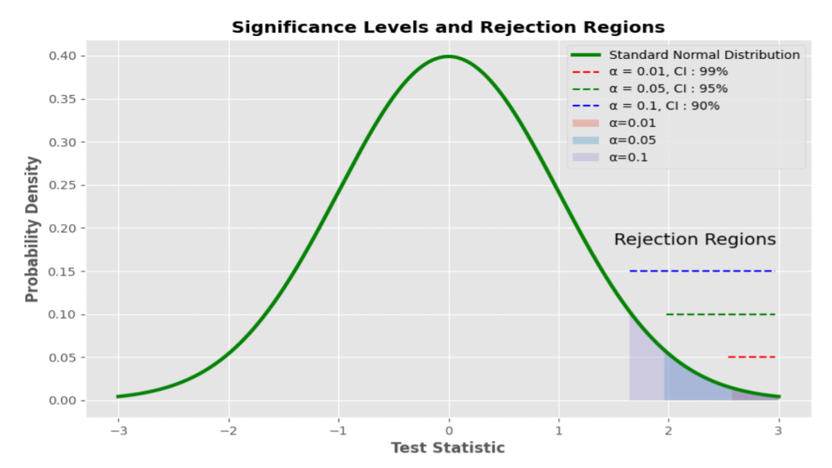
Table of Contents

1. Introduction to Sample of Null Hypothesis

In the realm of statistical analysis and hypothesis testing, the concept of a null hypothesis holds significant importance. Let’s delve into what exactly a null hypothesis entails, its structure, significance levels, types, applications, and much more. In any statistical study, researchers aim to test hypotheses to draw meaningful conclusions about populations or phenomena.

The null hypothesis, often denoted as Ho serves as the default assumption or the status quo that there is no significant difference or effect. It represents the hypothesis of no change or no effect. A sample of Null Hypothesis could be: “There is no significant difference in the mean scores of two groups.”

2. Understanding Sample of Null Hypothesis Testing

What is a Null Hypothesis?

The null hypothesis proposes that there is no difference or relationship between variables or that any observed difference is due to random variation. It essentially assumes that any observed difference is the result of chance.

Importance of Null Hypothesis in Research

The null hypothesis is crucial in hypothesis testing as it provides a benchmark for comparison. It allows researchers to evaluate the strength of evidence against the null hypothesis and determine whether the observed results are statistically significant.

3. Structure of a Null Hypothesis

Formulation

A null hypothesis is typically formulated as a statement that there is no effect, no relationship, or no difference between variables. It is often expressed in terms of population parameters.

Examples

Ho: µ= 50 (The population mean is equal to 50)
Ho: σ2= 25 (The population variance is equal to 25)

4. Significance Levels and Rejection Criteria

Alpha Levels

Significance levels play a crucial role in hypothesis testing, a fundamental aspect of statistical analysis. When conducting research or analyzing data, researchers need to determine the significance of their findings to draw valid conclusions. This article explores the significance levels and rejection criteria, focusing on alpha levels and their implications in statistical inference.

1. Understanding Alpha Levels

Alpha levels, often denoted as α, represent the threshold for accepting or rejecting a null hypothesis. In simpler terms, it indicates the likelihood of rejecting the null hypothesis when it is actually true. Commonly used alpha levels include 0.05, 0.01, and 0.10, although researchers may choose other values based on the context of their study. It’s essential to note that alpha levels are directly related to significance levels, as they determine the critical region for hypothesis testing.

2. Rejection Criteria in Hypothesis Testing

Rejection criteria define the conditions under which researchers reject the null hypothesis in favor of the alternative hypothesis. These criteria depend on factors such as the chosen alpha level, sample size, and statistical power. There are different types of rejection criteria, including the critical value approach, p-value approach, and confidence interval approach, each with its advantages and limitations.

3. Importance of Choosing the Right Alpha Level

Choosing the appropriate alpha level is crucial as it directly influences the likelihood of Type I and Type II errors. A Type I error occurs when the null hypothesis is wrongly rejected, while a Type II error occurs when the null hypothesis is wrongly accepted. Researchers must balance the risks associated with these errors to ensure the validity of their findings.

4. Common Alpha Levels in Different Fields

Alpha levels vary across different fields and disciplines. For example, in medical research, a more conservative alpha level (e.g., 0.01) may be preferred to minimize the risk of false positives. In contrast, social sciences may use a higher alpha level (e.g., 0.10) due to the exploratory nature of many studies. Factors such as sample size, effect size, and practical implications also influence the choice of alpha levels.

Critical Values

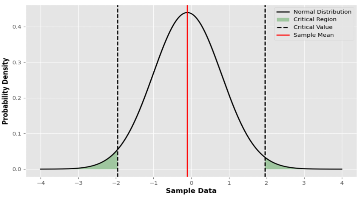
Critical values are thresholds used to determine whether to reject the null hypothesis based on the observed test statistic. These critical values are determined based on the chosen significance level and the distribution of the test statistic.

1. Determining Critical Values

Critical values are determined based on the chosen significance level, often denoted by the Greek letter alpha (α). The importance of the significance level lies in its indication of the likelihood of rejecting the null hypothesis, even when it is valid. Common methods for determining critical values include reference tables, statistical software, and mathematical formulas tailored to specific statistical tests and distributions.

2. Critical Values in Hypothesis Testing

In hypothesis testing, critical values play a vital role in assessing the statistical significance of results. Researchers compare the calculated test statistic with the critical value associated with the chosen significance level. If the test statistic exceeds the critical value, it suggests that the observed results are unlikely to have occurred by chance, leading to the rejection of the null hypothesis in favor of the alternative hypothesis.

3. Z-Score and Critical Values

The z-score, also known as the standard score, represents the number of standard deviations a data point is from the mean of a distribution. Critical values for z-tests are commonly used in scenarios involving large sample sizes or when the population standard deviation is known. These critical values help determine the boundaries for rejecting or retaining the null hypothesis based on the calculated z-score.

4. T-Value and Critical Values

When dealing with smaller sample sizes or situations where the population standard deviation is unknown, t-tests are employed, and critical values for t-tests are utilized. These critical values are derived from the t-distribution and are crucial for determining the significance of results obtained from t-tests.

5. Chi-Square Test and Critical Values

The chi-square test is frequently used in categorical data analysis to assess the association between categorical variables or goodness-of-fit to a particular distribution. Critical values for chi-square tests are employed to determine whether the observed data significantly deviate from the expected values under the null hypothesis.

6. Critical Values in Confidence Intervals

Critical values are integral to constructing confidence intervals, which provide estimates of population parameters based on sample data. The margin of error in confidence intervals is determined by the critical value corresponding to the chosen confidence level, allowing researchers to quantify the uncertainty associated with their estimates.

7. Evaluating Significance with Critical Values

Proper evaluation of significance using critical values requires careful consideration of various factors, including the chosen significance level, sample size, and assumptions underlying the statistical test. Researchers must critically assess the relevance and implications of their findings based on the observed test statistics and corresponding critical values.

8. Critical Values in Regression Analysis

In regression analysis, critical values play a crucial role in assessing the significance of regression coefficients, testing hypotheses about relationships between variables, and evaluating the overall fit of regression models. By comparing calculated test statistics with critical values derived from appropriate distributions, researchers can make informed inferences about the strength and direction of relationships in their data.

5. Common Misconceptions about the Null Hypothesis

Many mistakenly interpret a non-significant result as evidence in support of the null hypothesis rather than acknowledging the possibility of Type II errors. It’s essential to recognize that failing to reject the null hypothesis does not necessarily mean accepting it as true.

6. Applications of Null Hypothesis in Different Fields

Null hypothesis testing is widely utilized in various disciplines, including psychology, biology, economics, and sociology, to evaluate research hypotheses and draw conclusions. It provides a systematic approach to analyzing data and making inferences about populations.

7. Challenges and Limitations of Null Hypothesis Testing

Sample Size Determination

Determining an appropriate sample size is crucial for hypothesis testing to ensure adequate statistical power. Small sample sizes may lead to unreliable results and increased risk of Type II errors.

Selection Bias

Selection bias occurs when the sample is not representative of the population, leading to skewed or biased results. Researchers must take steps to minimize selection bias and ensure the generalizability of findings.

Assumptions Violation

In academic writing, researchers must clearly articulate their null hypotheses, along with alternative hypotheses, to facilitate the reproducibility and transparency of their findings. This involves clearly stating the research question, formulating testable hypotheses, and providing a rationale for the chosen hypotheses. A Sample of Null Hypothesis might be that there is no significant difference in the mean scores between the control group and the experimental group.

8. Future Directions in Null Hypothesis Research

Advancements in statistical methodologies and computational techniques continue to shape the landscape of null hypothesis testing. Researchers are exploring innovative approaches to address existing limitations and improve the robustness of hypothesis tests.

9. Null Hypothesis in Academic Writing

In academic writing, researchers must clearly articulate their null hypotheses, along with alternative hypotheses, to facilitate the reproducibility and transparency of their findings. This involves clearly stating the research question, formulating testable hypotheses, and providing a rationale for the chosen hypotheses. An example of a Sample of Null Hypothesis could be testing whether there is no difference in test scores between students who receive traditional instruction versus those who receive online instruction.

10. Practical Tips for Formulating Null Hypotheses

Specificity

Null hypotheses should be specific and clearly define the expected outcome or lack thereof. Vague or ambiguous null hypotheses can lead to confusion and misinterpretation of results.

Testability

Null hypotheses should be testable using empirical data and statistical methods. Researchers should ensure that null hypotheses can be falsified through hypothesis testing procedures.

Theoretical Grounding

Null hypotheses should be grounded in relevant theoretical frameworks and previous research findings. This helps to contextualize the research question and provides a basis for formulating testable hypotheses.

11. Null Hypothesis Examples in Real Studies

Psychology

In psychological research, null hypotheses are commonly used to assess the absence of relationships or differences between variables. For example, a study may test whether there is a difference in anxiety levels between two treatment groups.

Biology

In biology, null hypotheses are often used to evaluate the effectiveness of treatments or interventions. For instance, a study may test whether a new drug has no effect on the growth rate of cancer cells compared to a placebo. This Sample of Null Hypothesis allows researchers to rigorously assess the impact of the treatment by comparing it to a scenario where there is assumed to be no effect.

Economics

In economics, null hypotheses are frequently employed to assess the impact of policy interventions or changes in economic variables. For example, a study may test whether there is no difference in unemployment rates before and after the implementation of a new government policy.

12. Considerations in Null Hypothesis Testing

Statistical Power

Statistical power denotes the likelihood of accurately rejecting the null hypothesis when it’s invalid. Higher statistical power increases the likelihood of detecting true effects or differences.

Effect Size

Effect size quantifies the extent of the disparity or correlation between variables. A larger effect size indicates a stronger relationship or more significant difference.

Confidence Intervals

Confidence intervals offer a span of values where the true population parameter is expected to lie. They offer additional insights into the precision and reliability of estimated effects.

Multiple Comparisons

When conducting multiple hypothesis tests simultaneously, researchers must adjust for multiple comparisons to control the overall Type I error rate. Common methods include Bonferroni correction and false discovery rate control.

13. Practical Implications of Null Hypothesis Testing

Decision Making

Null hypothesis testing informs decision-making processes in various domains, including medicine, business, and public policy. Statistical evidence obtained from hypothesis tests guides strategic planning and resource allocation. A Sample of Null Hypothesis in this context could be that there is no significant difference in sales performance between two different marketing strategies.

Policy Development

Governments and organizations rely on null hypothesis testing to evaluate the effectiveness of policies and interventions. Evidence-based policymaking requires rigorous evaluation of hypotheses and empirical data.

Scientific Inquiry

Null hypothesis testing is fundamental to scientific inquiry and the advancement of knowledge. It enables researchers to systematically investigate research questions and generate new insights into natural phenomena.

Bayesian Approaches

Bayesian methods offer an alternative framework for hypothesis testing that incorporates prior knowledge and uncertainty into statistical inference. Bayesian hypothesis testing allows for more flexible modeling and robust estimation of parameters.

Machine Learning Techniques

Machine learning techniques, such as deep learning and neural networks, are increasingly being applied to hypothesis-testing problems. These approaches enable automated feature extraction and pattern recognition, facilitating complex data analysis and interpretation. A Sample of Null Hypothesis could involve testing whether a specific neural network architecture yields no improvement in accuracy compared to a baseline model.

Reproducibility Initiatives

Efforts to promote reproducibility and transparency in research have led to the development of reproducibility initiatives and open science practices. These initiatives aim to address issues of publication bias, data sharing, and methodological transparency in null hypothesis testing.

15. Example for Sample of Null Hypothesis in “R” Code

1. Assumption, Plots, and t-test for a sample of the null hypothesis in “R” code

library(psych)
library(tidyverse)

sample1 <- c(10, 11, 12, 15, 16, 13, 14, 12, 13, 15, 14, 13, 14, 15)

summary(sample1)
# 1. Assumption (Continuous scale) - check(skew kurtosis - values)
describe(sample1)
# 2. Assumption (Normality)

shapiro.test(sample1)
# Plot
qqnorm(sample1)
qqline(sample1)
# 3. Assumption (Outlier)
boxplot(sample1)
#One sample  t-test 

t.test(sample1, mu=13, alpha=.05, alternative = "two.sided")

2. The plot of the sample of null Hypothesis in “R” Code

# Load required libraries
library(ggplot2)

# Sample data
sample_data <- c(10, 11, 12, 15, 16, 13, 14, 12, 13, 15, 14, 13, 14, 15)

# Sample mean and confidence interval
sample_mean <- 13.35714
ci_lower <- 12.38025
ci_upper <- 14.33404

# Create a data frame for plotting
df <- data.frame(x = sample_data)

# Plot histogram with ggplot2
ggplot(df, aes(x)) +
  geom_histogram(aes(y=..density..), bins = 10, fill = 'gray', color = 'black', alpha = 0.7) +
  geom_density(color = 'black',size = 1.0) +
  geom_vline(xintercept = sample_mean, linetype = 'dashed', color = 'red', size = 1) +
  geom_vline(xintercept = c(ci_lower, ci_upper), linetype = 'dashed', color = 'blue', size = 0.9) +
  labs(title = 'Sample Data with 95% CI', x = 'Values', y = 'Density') +
  theme_grey() +
  theme(legend.position = 'top') +
  guides(color = FALSE)

16. Example for Sample of Null Hypothesis in “Python” Code

1. Analysis of null hypothesis

##             Example for Sample of Null Hypothesis

import numpy as np
import matplotlib.pyplot as plt
import seaborn as sns
from scipy import stats

# Example data
sample = np.array([10, 11, 12, 15, 16, 13, 14, 12, 13, 15, 14, 13, 14, 15])

# Hypothesized population mean
pop_mean = 13.0 

# Perform one-sample t-test
t_statistic, p_value = stats.ttest_1samp(sample, pop_mean)

# Calculate the mean and standard deviation
sample_mean = np.mean(sample)
sample_std = np.std(sample, ddof=1)  # Using Bessel's correction (ddof=1) for sample standard deviation

# Calculate the standard error of the mean (SEM)
n = len(sample)
sem = sample_std / np.sqrt(n)

# Calculate the 95% confidence interval (CI)
t_critical = stats.t.ppf(0.975, df=n-1)  # Two-tailed test
ci_lower = sample_mean - t_critical * sem
ci_upper = sample_mean + t_critical * sem

# Print the results of the t-test
print("T-statistic:", t_statistic)
print("P-value:", p_value)

# Interpret the results of the t-test
alpha = 0.05  # significance level
if p_value < alpha:
    print("Reject the null hypothesis. The sample mean is significantly different from the population mean.")
else:
    print("Fail to reject the null hypothesis. The sample mean is not significantly different from the population mean.")

2. Example plot for Sample of Null Hypothesis in “Python” Code

import numpy as np
import matplotlib.pyplot as plt
import seaborn as sns
from scipy import stats

plt.style.use('ggplot')
plt.figure(figsize=(8, 6))

# Example data
sample = np.array([10, 11, 12, 15, 16, 13, 14, 12, 13, 15, 14, 13, 14, 15])

# Hypothesized population mean
pop_mean = 13.0 

# Perform one-sample t-test
t_statistic, p_value = stats.ttest_1samp(sample, pop_mean)

# Calculate the mean and standard deviation
sample_mean = np.mean(sample)
sample_std = np.std(sample, ddof=1)  # Using Bessel's correction (ddof=1) for sample standard deviation

# Calculate the standard error of the mean (SEM)
n = len(sample)
sem = sample_std / np.sqrt(n)

# Calculate the 95% confidence interval (CI)
t_critical = stats.t.ppf(0.975, df=n-1)  # Two-tailed test
ci_lower = sample_mean - t_critical * sem
ci_upper = sample_mean + t_critical * sem

# Plot histogram with KDE, setting the line color to gray and the line width to 1
sns.histplot(sample, kde=True, color='gray', stat='density', linewidth=1)
plt.title('Sample Data with 95% CI')
plt.xlabel('Values')
plt.ylabel('Density')

# Plot the sample mean with a line color of red, dashed linestyle, and line width of 3
plt.axvline(x=sample_mean, color='red', linestyle='--', linewidth=3, label='Sample Mean')

# Plot the 95% confidence interval with a line color of green, dashed linestyle, and line width of 2
plt.axvline(x=ci_lower, color='green', linestyle='--', linewidth=2, label='Lower 95% CI')
plt.axvline(x=ci_upper, color='green', linestyle='--', linewidth=2, label='Upper 95% CI')

#plt.savefig(' save _ sample of null hypothesis plot .png')

# Show the plot
plt.show()

17. Conclusion

In conclusion, the null hypothesis serves as a foundational concept in hypothesis testing, enabling researchers to assess the validity of alternative hypotheses and draw evidence-based conclusions from empirical data. Understanding the role and significance of null hypotheses is essential for conducting rigorous and meaningful research across various disciplines.

A sample of a null hypothesis might involve stating that there is no significant difference in test scores between two groups. In conclusion, null hypothesis testing is a fundamental tool in statistical analysis and scientific inquiry, providing a systematic approach to evaluating research hypotheses and drawing evidence-based conclusions. By grasping the fundamentals and practicalities of null hypothesis testing, scholars can bolster the precision and trustworthiness of their investigations, thus fostering progress in their specific domains of expertise.

Critical values are indispensable tools in statistical analysis, providing researchers with essential guidelines for interpreting data and drawing meaningful conclusions. By understanding the significance of critical values and their implications in different statistical procedures, practitioners can enhance the rigor and reliability of their research findings, contributing to advancements in their respective fields.

18. FAQs

Q1: What is the purpose of the null hypothesis? The null hypothesis provides a baseline assumption for hypothesis testing, allowing researchers to evaluate whether observed differences or effects are statistically significant.

Q2: How do you interpret a p-value in null hypothesis testing? A p-value represents the probability of observing a test statistic as extreme as, or more extreme than, the one observed, given that the null hypothesis is true. A decreased p-value signifies more compelling evidence opposing the null hypothesis.

Q3: Can you have a null hypothesis without an alternative hypothesis? Yes, it is possible to formulate a null hypothesis without explicitly specifying an alternative hypothesis. However, in hypothesis testing, researchers typically consider both null and alternative hypotheses to assess the presence of an effect or relationship.

Q4: What are Type I and Type II errors in null hypothesis testing? Type I error occurs when the null hypothesis is incorrectly rejected, falsely indicating the presence of an effect or difference. Type II error occurs when the null hypothesis is incorrectly retained, failing to detect a true effect or difference.

Q5: How can researchers mitigate the risk of Type I errors in hypothesis testing? Researchers can reduce the risk of Type I errors by adjusting the significance level alpha or conducting post-hoc analyses to confirm the robustness of significant findings.

Q6: What is statistical power, and why is it important in null hypothesis testing? Statistical power is the likelihood of accurately dismissing the null hypothesis when it’s untrue. It is important in null hypothesis testing because it determines the ability of a study to detect true effects or differences. Higher statistical power increases the likelihood of finding significant results if they exist.

Q7: How do you calculate effect size in null hypothesis testing? Effect size gauges the extent of the disparity or association between variables. It is typically calculated using standardized metrics such as Cohen’s d for means or Pearson’s r for correlations. Effect size calculations provide additional insights into the practical significance of research findings beyond statistical significance.

Q8: What are confidence intervals, and how are they used in null hypothesis testing? Confidence intervals offer a range of values where the true population parameter is expected to lie, with a specified level of confidence. They are used in null hypothesis testing to estimate the precision and reliability of estimated effects or differences. Confidence intervals offer a more nuanced understanding of research findings and help interpret the practical significance of results.

Q9: How do researchers address ethical considerations in null hypothesis testing? Researchers address ethical considerations in null hypothesis testing by adhering to ethical guidelines and standards of conduct. This includes obtaining informed consent from participants, minimizing risks, protecting confidentiality, and ensuring research integrity. Transparent reporting of methods and results promotes reproducibility and accountability in null hypothesis testing.

Q10: What are some emerging trends in null hypothesis testing? Emerging trends in null hypothesis testing include Bayesian approaches, machine learning techniques, and reproducibility initiatives. Bayesian methods incorporate prior knowledge and uncertainty into statistical inference, while machine learning techniques enable automated data analysis and interpretation. Reproducibility initiatives aim to promote transparency and openness in research practices, addressing issues of publication bias and methodological transparency.

Read more

  1. Data Visualization: Line Plot Example
  2. Linear Regression in Machine Learning Python code
How to Find Correlation Coefficient in R

How to Find Correlation Coefficient in R | Mastering Correlation Analysis and Example
Introduction to Correlation Coefficient

How to Find Correlation Coefficient in R is a common question among those involved in data analysis. The correlation coefficient is a statistical measure used to determine the strength and direction of the relationship between two variables.

In data analysis, understanding this concept is essential for identifying patterns and making predictions. It quantifies how closely the two variables move in relation to each other, providing valuable insights into the data.

In mathematics and statistics, a coefficient is a numerical or constant value that is multiplied by a variable or another term in an algebraic expression or equation. It represents the degree or magnitude of a particular component within the expression.

What is Coefficient

Coefficients can appear in various contexts and have different meanings depending on the field of study. In general terms, a coefficient provides information about the relationship or interaction between different variables or factors in a mathematical equation or formula.

For example, in a linear equation such as y = mx + b, where “m” represents the slope of the line and “b” represents the y-intercept, both “m” and “b” are coefficients. The coefficient “m” determines the rate of change of the dependent variable (y) with respect to the independent variable (x), while the coefficient “b” determines the y-coordinate of the point where the line intersects the y-axis.

In statistics, coefficients often appear in regression analysis, where they represent the estimated effects of independent variables on a dependent variable. For instance, in a simple linear regression model y = β0 + β1x + ε, the coefficients β0 and β1 represent the intercept and slope of the regression line, respectively. They quantify the strength and direction of the relationship between the independent variable (x) and the dependent variable (y).

Coefficients can also appear in polynomial equations, Fourier series, and other mathematical expressions, where they play a crucial role in determining the overall behavior and properties of the equation. Depending on the context, coefficients may be real numbers, complex numbers, or even matrices in more advanced mathematical settings.

Understanding Correlation in Statistics

Correlation indicates the degree to which two or more variables change simultaneously. A positive correlation indicates that as one variable increases, the other variable also tends to increase, while a negative correlation means that as one variable increases, the other tends to decrease.

The correlation coefficient, symbolized by “r,” spans from -1 to 1. A value of -1 signifies a complete negative correlation, 1 represents a complete positive correlation, and 0 suggests no correlation.

Methods of Correlation

Correlation is a fundamental concept in statistics and data analysis that measures the relationship between two variables. It aids researchers and analysts in comprehending the correlation between alterations in one variable and those in another. There are several methods of correlation, each with its unique approach and applications.

The Pearson correlation coefficient

The Pearson correlation coefficient, often referred to as Pearson’s r, quantifies the linear association between two continuous variables. Its values range from -1 to +1: -1 denotes a flawless negative correlation, +1 signifies a perfect positive correlation, and 0 indicates no correlation.

Spearman’s Rank Correlation

Spearman’s rank correlation evaluates the monotonic connection between two variables, irrespective of whether it follows a linear pattern. Instead of using raw data, it ranks the variables and calculates the correlation based on the differences in ranks.

Kendall’s Tau

Kendall’s tau is another non-parametric measure of association that evaluates the similarity in the ordering of data points between two variables. It is particularly useful when dealing with ordinal data or when the assumptions of Pearson correlation are violated.

Understanding Correlation vs. Causation

It’s crucial to differentiate between correlation and causation. While correlation indicates a relationship between variables, it does not imply causation. Correlation simply suggests that changes in one variable are associated with changes in another, but it does not prove that one variable causes the other to change.

Methods for Assessing Correlation Significance

Determining whether a correlation coefficient is statistically significant involves hypothesis testing, confidence intervals, and assessing p-values. These methods help researchers determine whether the observed correlation is likely to occur due to chance.

Non-parametric Correlation Methods

Non-parametric correlation methods, such as Spearman’s rank correlation and Kendall’s tau, are valuable when data does not meet the assumptions of parametric tests. They provide robust measures of association without requiring the data to follow a specific distribution.

Correlation in Real-world Applications

Correlation finds applications in various fields, including business, medicine, and social sciences. It helps economists predict market trends, doctors assess the effectiveness of treatments, and psychologists understand human behavior.

Challenges and Considerations

Despite its usefulness, correlation analysis faces challenges such as dealing with outliers, interpreting results in complex datasets, and addressing sample size limitations. Researchers must be aware of these challenges and apply appropriate techniques to mitigate them.

Correlation and Machine Learning

In machine learning, correlation plays a vital role in feature selection, preprocessing, and algorithm design. Understanding the correlation between features helps improve model performance and interoperability.

Correlation in Time Series Analysis

In time series analysis, correlation helps identify patterns and dependencies over time. Autocorrelation measures the correlation between a variable and its lagged values, while seasonality and trend analysis uncover recurring patterns and long-term trends.

Ethics and Bias in Correlation Studies

Ethical considerations are essential in correlation studies to ensure fair and unbiased results. Researchers must address potential biases in data collection and interpretation, as well as consider the ethical implications of their findings.

Advancements in correlation analysis methods, combined with the proliferation of big data and AI, open up new possibilities for innovation. Emerging trends include the integration of correlation with machine learning algorithms and its application in diverse domains.

Understanding Different Types of Correlation and Their Examples

When delving into statistical analysis, one often encounters correlation coefficients, which measure the strength and direction of the relationship between two variables. Interpreting these correlation coefficients is crucial for drawing meaningful insights from data. Here, we’ll explore the types of correlation and provide real-world examples to elucidate each type.

1. Positive Correlation

A positive correlation suggests that when one variable rises, the other variable typically follows suit and increases as well. This implies that both variables shift in tandem.

1.1 Example:

An increase in the number of hours spent studying usually leads to higher grades. As study time increases, grades typically improve. For instance, if a student studies for 4 hours a day, they may achieve a GPA of 3.5. If they increase their study time to 6 hours a day, their GPA may rise to 3.8. This demonstrates a positive correlation between study time and academic performance.

2. Negative Correlation

A negative correlation implies that when one variable increases, the other variable tends to decrease. In essence, the variables move in opposite directions.

2.1 Example:

The more frequently individuals exercise, the lower their body weight tends to be. In this case, as exercise frequency rises, body weight decreases, indicating a negative correlation between exercise frequency and body weight. For example, if a person exercises three times a week, they might weigh 160 pounds. However, if they increase their exercise frequency to five times a week, their weight might decrease to 150 pounds.

3. No Correlation

When there’s no correlation, it suggests that there’s no discernible connection between the variables. Changes in one variable do not affect the other, and there’s no consistent pattern observed.

3.1 Example:

There’s no correlation between the number of clouds in the sky and the price of stocks. The fluctuations in cloud cover don’t impact stock prices, demonstrating a lack of correlation between these two variables. For instance, on days with heavy cloud cover, the stock prices may remain stable, while on clear days, the stock prices may fluctuate unpredictably.

4. Strong Correlation

Strong correlation signifies a robust relationship between variables, where changes in one variable are highly indicative of changes in the other. This indicates a clear pattern between the variables.

4.1 Example:

There’s a strong positive correlation between temperature and ice cream sales. As temperatures rise, the sales of ice cream increase significantly. For example, when the temperature reaches 90°F, ice cream sales may surge to 500 units per day, whereas at 70°F, sales might only reach 200 units per day. This demonstrates a strong correlation between temperature and ice cream sales, where higher temperatures lead to higher sales.

5. Weak Correlation

Weak correlation indicates a less pronounced relationship between variables, where changes in one variable may not consistently predict changes in the other. The relationship is not as clear or reliable compared to a strong correlation.

5.1 Example:

The correlation between shoe size and intelligence is weak. While there might be some correlation, it’s not substantial enough to make accurate predictions about intelligence based solely on shoe size. For example, individuals with larger shoe sizes may not necessarily have higher IQ scores. This indicates a weak correlation between these two variables.

6. Linear Correlation

Linear correlation suggests that the relationship between variables can be represented by a straight line. This means that as one variable changes, the other variable changes proportionally.

6.1 Example:

The relationship between the number of years of experience and salary in a job may exhibit a linear correlation. Generally, as experience increases, salary tends to rise proportionally. For instance, a person with 5 years of experience may earn $50,000 per year, while someone with 10 years of experience may earn $100,000 per year. This demonstrates a linear correlation between experience and salary.

7. Nonlinear Correlation

Nonlinear correlation indicates a relationship between variables that don’t follow a straight line but rather a curve. This means that the relationship between the variables is more complex and cannot be represented by a straight line.

7.1 Example:

The connection between the quantity of fertilizer applied and crop yield could exhibit non-linear characteristics. Initially, increasing fertilizer may lead to significant yield increases, but at a certain point, additional fertilizer might not produce the same yield gains. For example, applying 100 kg of fertilizer may increase crop yield by 20%, but applying 200 kg may only increase yield by 10%. This demonstrates a nonlinear correlation between fertilizer use and crop yield.

Introduction to R Programming Language

R stands as a formidable tool in the realm of programming, providing a robust platform for statistical analysis and visualization. It is widely used for data analysis and statistical modeling due to its extensive range of built-in functions and packages. How to Find Correlation Coefficient in R is a common inquiry due to R’s popularity in statistical analysis. R provides a user-friendly interface through RStudio, making it accessible to both beginners and advanced users alike.

Methods How to Find Correlation Coefficient in R

There are several methods available in R for calculating the correlation coefficient. How to Find Correlation Coefficient in R involves various techniques:

1. Using cor() Function: The cor() function is a simple and efficient way to calculate the correlation coefficient between two variables or a matrix of variables. It computes the correlation matrix, which contains the pairwise correlation coefficients between variables.

2. Using cor.test() Function: The cor.test() function is used to perform hypothesis tests on correlation coefficients. How to Find Correlation Coefficient in R is facilitated by this function as it calculates the correlation coefficient along with its associated p-value, allowing users to assess the significance of the correlation.

3. Using Pearson’s Correlation Coefficient: Pearson correlation coefficient measures the linear relationship between two variables. How to Find Correlation Coefficient in R typically involves using Pearson’s method for normally distributed data with a linear relationship.

4. Using Spearman’s Correlation Coefficient: Spearman correlation coefficient assesses the monotonic relationship between two variables, which may not necessarily be linear. It is more robust to outliers and non-linear relationships compared to Pearson’s correlation coefficient.

Step-by-Step Guide to How to Find Correlation Coefficient in R

To find the correlation coefficient in R, follow these steps:

1. Installing R and RStudio: Download and install R from the Comprehensive R Archive Network (CRAN) website, and install RStudio for a user-friendly interface.

2. Importing Datasets: Load the datasets into R using functions like read.csv() or read.table(). Ensure that the datasets are properly formatted and contain the variables of interest.

3. Calculating Correlation Coefficient: Use the appropriate method (cor(), cor.test(), etc.) to calculate the correlation coefficient between the desired variables. Specify any additional parameters such as method (Pearson, Spearman, etc.) as needed.

4. Interpreting the Results: Analyze the correlation coefficient value and its significance to draw conclusions about the relationship between variables. How to Find Correlation Coefficient in R requires careful interpretation, considering factors such as the magnitude of the coefficient, its direction (positive or negative), and the associated p-value.

Practical Examples in “R”

Download the sample dataset for correlation analysis

310 B

Correlation Analysis “R” code

#         <====   How to Find Correlation Coefficient in R Code =====>

# Load necessary libraries
library(readr)  # for reading csv files
library(ggplot2)  # for plotting
library(AgroR)  # assuming plot_cor function is defined in this package

# Read the data from CSV file
correlation_data <- read_csv("correlation_data.csv")

# Extracting variables
x <- correlation_data$sample_1
y <- correlation_data$sample_2

# Perform correlation test
cor.test(x, y)

Plot correlation “R” code

# Plot correlation
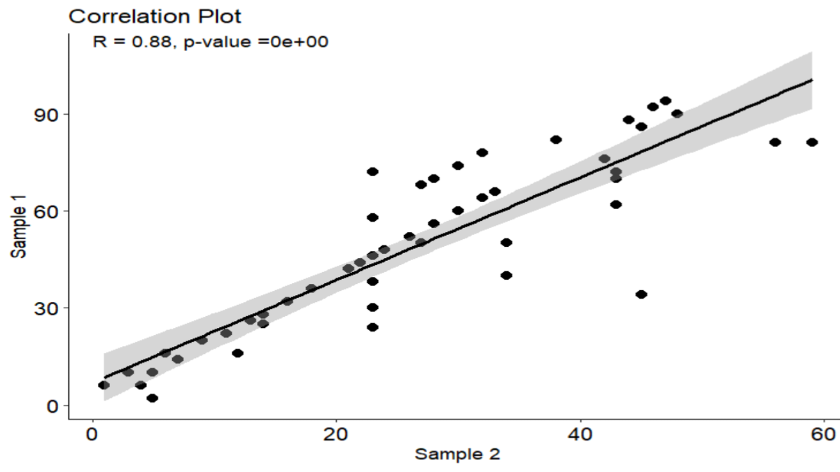
plot_cor(x, y,
         method = "pearson",
         ylab = "Sample 1",
         xlab = "Sample 2",
         title = "Correlation Plot",
         theme = theme_classic(),
         pointsize = 4,  # size to 4
         shape = 20,
         color = "black",   # color to black
         ic = TRUE)

Result

The analysis employed Pearson’s product-moment correlation to explore the connection between variables x and y, revealing a robust positive correlation with an r-value of 0.880. This indicates a significant linear relationship. Further bolstering this relationship is the t-value of 12.728, supported by 47 degrees of freedom (df). The minuscule p-value (< 2.2e-16) strongly refutes the null hypothesis, suggesting that chance alone is highly improbable. With a 95% confidence interval spanning from 0.796 to 0.931, confidence in the correlation estimation is high. In summary, these results underscore a strong positive association between variables x and y, indicating that changes in one variable closely mirror changes in the other.

Advantages of Using R for Calculating Correlation Coefficient

R provides a wide range of built-in functions and packages specifically designed for statistical analysis, making it a versatile tool for data scientists and researchers.

It offers comprehensive visualization capabilities through packages like ggplot2, allowing users to create informative plots and graphs to illustrate correlation results. R is open-source and has a vast community of users and developers, ensuring continuous improvement and support through online forums, tutorials, and documentation.

Limitations and Considerations

While R is powerful, it may have a steep learning curve for beginners, particularly those without prior programming experience. However, there are plenty of resources available, such as tutorials, books, and online courses, to support users in learning R.

Interpretation of correlation results requires caution, as correlation does not imply causation. It is essential to consider potential confounding variables and verify assumptions such as linearity and homoscedasticity before drawing conclusions from correlation analyses.

Large datasets may require efficient coding practices and memory management to avoid performance issues in R. Users should familiarize themselves with optimization techniques and data manipulation functions to handle big data effectively.

Conclusion

To summarize, mastering the technique of calculating correlation coefficients in R is imperative for both data analysts and researchers alike. By utilizing the various methods and functions available in R, users can efficiently analyze relationships between variables and gain valuable insights into their data.

Whether you are a beginner or an experienced data scientist, mastering correlation analysis in R can enhance your ability to extract meaningful information from datasets and make informed decisions based on data-driven insights. Understanding the various types of correlation and their implications is crucial for accurate data analysis and interpretation.

Whether it’s positive, negative, strong, or weak correlation, recognizing these patterns enables researchers and analysts to draw meaningful conclusions from their data. By leveraging various correlation methods and addressing associated challenges, researchers can uncover valuable information that informs decision-making and drives innovation across disciplines

FAQs

1. How do I interpret a correlation coefficient? A correlation coefficient close to 1 or -1 indicates a strong relationship between variables, while a coefficient close to 0 suggests a weak or no relationship.

2. Can I use R for other types of statistical analysis? Yes, R offers a wide range of statistical techniques beyond calculating correlation coefficients, including regression analysis, hypothesis testing, and data visualization.

3. What precautions should I take when interpreting correlation results? Avoid inferring causation from correlation, consider potential confounding variables, and verify assumptions such as linearity and homoscedasticity.

4. Is R suitable for beginners in statistical analysis? While R may have a learning curve, there are plenty of resources available, such as tutorials, books, and online communities, to support beginners in mastering statistical analysis with R.

5. What does it mean if there’s no correlation between variables? If there’s no correlation, changes in one variable do not predict or influence changes in the other variable.

6. Can correlation imply causation? No, correlation does not imply causation. Even if two variables are correlated, it doesn’t necessarily mean that changes in one variable cause changes in the other.

7. How can correlation analysis be useful in real-life scenarios? Correlation analysis helps in understanding the relationships between various factors, which can be valuable in fields such as economics, psychology, and healthcare for making informed decisions.

8. Can correlation prove causation? No, correlation measures the relationship between variables but does not establish causation. Additional evidence and experiments are needed to determine causality.

9. What is the difference between Pearson correlation and Spearman correlation? Pearson correlation assesses linear relationships between continuous variables, while Spearman correlation evaluates monotonic relationships based on ranked data.

10. When should I use non-parametric correlation methods? Non-parametric methods like Spearman’s rank correlation and Kendall’s tau are suitable when data does not meet the assumptions of parametric tests or when dealing with ordinal data.

Read More

  1. Linear Regression
  2. ARIMA Forecasting Model
  3. Z Critical Value for 95% Confidence Interval
How to Find P Value from t Statistic

How to Find P Value from t Statistic: A Comprehensive Guide
Introduction

In the realm of statistics, the t-statistic and p-value are fundamental concepts that play a crucial role in hypothesis testing and statistical analysis. Whether you’re a student conducting research or a professional analyzing data, understanding how to find p value from t statistic is essential for making informed decisions and drawing valid conclusions. This article aims to elucidate the process of deriving the p-value from the t statistic, providing clarity on its significance and practical implications

Understanding t Statistic

The t statistic, also known as Student’s t statistic, is a measure used to assess the difference between the means of two groups or the significance of a single sample mean. It quantifies the ratio of the difference between the sample mean and the population mean to the standard error of the mean. In simpler terms, the t statistic indicates how much the sample mean deviates from the population mean in standard deviation units.

Definition and Significance

The t-statistic holds significance primarily in hypothesis testing, where it serves as the test statistic in various statistical tests, such as t-tests and analysis of variance (ANOVA). It allows researchers to determine whether the observed difference between groups is statistically significant or merely due to random variation.

The formula for Calculating t Statistic

The formula for calculating the t statistic depends on the type of statistical test being conducted. One-sample t-test formula is:

Significance of P Value

The p-value, short for “probability value,” is a measure that indicates the probability of obtaining the observed results (or more extreme results) under the assumption that the null hypothesis is true. In hypothesis testing, the null hypothesis represents the absence of an effect or relationship, while the alternative hypothesis suggests the presence of a significant effect.

Definition and Interpretation

A low p-value (< 0.05) suggests strong evidence against the null hypothesis, leading to its rejection in favor of the alternative hypothesis. Conversely, a high p-value (> 0.05) indicates weak evidence against the null hypothesis, failing to reject it. Therefore, the p-value serves as a yardstick for assessing the statistical significance of research findings.

Role in Hypothesis Testing

The p-value plays a pivotal role in hypothesis testing, guiding researchers in making decisions about the validity of their hypotheses. By comparing the p-value to a predetermined significance level (typically 0.05), researchers can determine whether the results are statistically significant and warrant further investigation.

In hypothesis testing, the p-value indicates the likelihood of encountering a test statistic as unusual as, or even more unusual than, the one derived from the sample data, assuming the null hypothesis holds true. A low p-value suggests that the outcomes observed are improbable due to random chance alone, presenting evidence that contradicts the null hypothesis.  Conversely, a large p-value suggests that the observed results are consistent with what would be expected under the null hypothesis, indicating that they may have occurred due to random fluctuations in the data.

When comparing the p-value to the significance level (α), researchers establish a threshold for determining the level of evidence required to reject the null hypothesis. Typically, a significance level of 0.05 is used, meaning that if the p-value is less than 0.05, the results are considered statistically significant, and the null hypothesis is rejected in favor of the alternative hypothesis. This signifies that the observed effect is likely real and not due to chance alone.

On the other hand, if the p-value is greater than 0.05, researchers fail to reject the null hypothesis, indicating that the observed results are not statistically significant. This suggests that there is insufficient evidence to conclude that the observed effect is genuine, and further investigation may be needed to draw definitive conclusions. In essence, the comparison of the p-value to the significance level provides researchers with a standardized approach to evaluating the strength of evidence against the null hypothesis. By adhering to this framework, researchers can confidently interpret the results of hypothesis tests and make informed decisions about the validity of their hypotheses, ultimately advancing scientific knowledge and understanding.

Understanding How to Find P Value from t Statistic

The t-statistic and p-value are intricately linked, with the latter being derived from the former. Understanding their relationship is crucial for interpreting the results of statistical tests accurately.

Explanation of Their Interdependence

The t-statistic and p-value both assess the likelihood of observing the sample data under the null hypothesis. As the magnitude of the t statistic increases (indicating a larger deviation of the sample mean from the population mean), the p-value decreases, signifying stronger evidence against the null hypothesis.

How P Value Is Derived from t Statistic

To derive the p-value from the t statistic, one typically refers to the t distribution table or uses statistical software. By comparing the calculated t statistic to the critical values in the t distribution, researchers can determine the probability of observing a t value as extreme as or more extreme than the calculated value.

Steps to Find P Value from t Statistic

While deriving the p value from the t statistic may seem daunting, following a systematic approach can simplify the process. Here’s a step-by-step guide:

Step 1: Determine the Significance Level

Before conducting the hypothesis test, specify the significance level (α), which represents the threshold for determining statistical significance. Frequently employed figures are 0.05 and 0.01.

Step 2: Find the Degrees of Freedom

The degrees of freedom (df) depend on the sample size and the type of statistical test being performed. For a one-sample t test, df =  n – 1 , where n is the sample size.

Step 3: Look Up Critical Values in t Distribution Table

Consult a t distribution table or use statistical software to find the critical values corresponding to the chosen significance level and degrees of freedom.

Step 4: Calculate the P Value

Using the critical values obtained in the previous step and the directionality of the test (one-tailed or two-tailed), calculate the p-value corresponding to the observed t statistic. Statistical software or online calculators can expedite this calculation process.

Practical Examples for How to Find P Value from t Statistic

Embarking on the journey of uncovering the P value from a T statistic, let’s delve into practical scenarios where this statistical concept comes to life:

For instance:

Scenario 1: Unveiling Insights through a One-Sample T Test

Imagine a scenario where a diligent researcher conducts a one-sample T test aiming to discern whether the average exam score of a student cohort significantly deviates from the established population mean (μ = 75). Upon meticulous calculations, the researcher derives a T statistic of 2.45, alongside degrees of freedom (df = 20). Leveraging statistical tools, they pinpoint the P value at 0.023. Given this P value’s diminutive stature compared to the significance level (α = 0.05), the researcher confidently dismisses the null hypothesis, affirming that the student cohort’s exam score markedly varies from the population mean.

Scenario 2: Unraveling Insights with a Paired T Test

Transitioning into a clinical study realm, envision researchers meticulously gauging the efficacy of a novel medication. With meticulous data collection on pre and post-medication blood pressure readings for each participant, researchers embark on a paired T test journey. Resultantly, they unearth a T statistic of -3.21, complemented by degrees of freedom (df = 29). Subsequent scrutiny reveals a P value of 0.003, indicative of statistical significance. Armed with this insight, researchers confidently affirm that the medication significantly influences blood pressure dynamics.

Scenario 3: Deciphering Distinctions via an Independent Samples T Test

Now, contemplate a study differentiating the mean cholesterol levels amid two distinct groups: patients administered a novel cholesterol-lowering drug versus those administered a placebo. Through an independent samples T test, researchers unearth a T statistic of -2.76, coupled with degrees of freedom (df = 48). Delving deeper, they discern a P value of 0.008, notably lower than the preset significance level (α = 0.05). With this revelation, researchers confidently repudiate the null hypothesis, asserting a substantial contrast in cholesterol levels between the two groups.

Importance of Correct Interpretation

While knowing how to calculate the p value from the t statistic is valuable, it’s equally essential to interpret the results accurately. Misinterpretation of statistical findings can lead to erroneous conclusions and misinformed decisions, highlighting the importance of careful analysis.

Avoiding Misinterpretation

Common pitfalls in interpreting statistical results include conflating correlation with causation, overlooking confounding variables, and misjudging the practical significance of findings. Researchers must exercise caution and critically evaluate the implications of their analyses.

 Impact on Decision-Making in Research

The correct interpretation of statistical results influences subsequent research directions, policy decisions, and practical applications. By accurately assessing the significance of research findings, researchers can contribute to evidence-based decision-making and advance knowledge in their respective fields.

Common Mistakes to Avoid

To ensure the validity and reliability of statistical analyses, researchers should be mindful of common mistakes that can compromise the integrity of their findings.

Misunderstanding Significance Level

Misinterpreting the significance level (α) can lead to errors in hypothesis testing. Researchers must adhere to the chosen significance level and avoid arbitrary adjustments based on the observed p value.

Incorrect Interpretation of t Statistic

Failing to understand the implications of the t statistic can result in faulty conclusions. Researchers should interpret the magnitude and directionality of the t statistic in the context of the research question and hypotheses.

Using Improper Degrees of Freedom

Incorrectly calculating or applying degrees of freedom can distort the results of statistical tests. Researchers must accurately determine the degrees of freedom based on the study design and sample characteristics.

Tools and Resources for Calculating P Value

In the era of digital technology, researchers have access to various tools and resources that facilitate the calculation of the p value from the t statistic.

Statistical Software

Software packages such as SPSS, R, and SAS offer robust statistical capabilities, including hypothesis testing and p value calculation. These tools streamline the analysis process and provide accurate results for researchers across disciplines.

Online Calculators

Numerous websites and online platforms provide free or subscription-based calculators for conducting statistical analyses. These user-friendly tools allow researchers to input their data and obtain p values and other relevant statistics quickly.

Excel Functions

Microsoft Excel offers built-in functions for statistical analysis, including functions for calculating t statistics and p values. While not as sophisticated as dedicated statistical software, Excel can be a convenient option for basic analyses and quick calculations.

Conclusion

In conclusion, How to Find P Value from t Statistic is indispensable for conducting rigorous statistical analyses and deriving meaningful conclusions from data. By understanding the relationship between these two measures and following the prescribed steps, researchers can ensure the accuracy and validity of their findings, contributing to advancements in knowledge and evidence-based decision-making.

FAQs

Q1: What is the significance level in hypothesis testing? The significance level, often denoted as α, establishes the threshold for rejecting the null hypothesis. It signifies the maximum likelihood of committing a Type I error.

Q2: Can the p value ever be greater than 1? No, the p value always falls between 0 and 1. A value exceeding 1 would lack coherence within the context of probability.

Q3: How can I determine the p value from a t statistic, and what is the role of degrees of freedom in this calculation? A: The understanding of degrees of freedom holds pivotal importance when calculating the p value from a t statistic. Essentially, degrees of freedom signify the independent information pieces within the sample data. For t tests, degrees of freedom are derived by subtracting one from the total observations. They shape the t statistic’s distribution and dictate the critical values, significantly impacting the p value determination. By comprehending degrees of freedom, researchers can effectively interpret hypothesis test outcomes and make well-informed decisions based on statistical significance.

Q4: Why is it crucial to utilize the accurate degrees of freedom in computations? Degrees of freedom directly influence the t distribution’s shape and the critical values used in hypothesis testing, underscoring the necessity for precise calculations to ensure valid results.

Q5: How do I calculate the p value from a test statistic, and what role does the significance level (α) play in hypothesis testing? A: In determining the p-value from a test statistic, the significance level (α) serves as a pivotal threshold for establishing statistical significance. Researchers typically predefine the significance level before conducting the hypothesis test, commonly opting for values like 0.05 or 0.01. This level represents the utmost probability of committing a Type I error, wherein the null hypothesis is erroneously rejected. By comparing the calculated p-value with the significance level, researchers ascertain the statistical significance of observed results and decide whether rejecting the null hypothesis is warranted.

Read more

1. Arima Forecasting Mode

2. Linear Regression

Simple Linear Regression in Machine Learning Python code

Linear Regression in Machine Learning Python Code: A Comprehensive Guide for Mastery
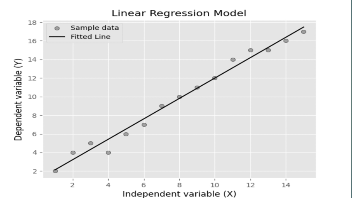
Introduction to Linear Regression

Linear regression in machine learning Python, a cornerstone concept in the fields of machine learning and statistical modeling, lays the foundation for understanding relationships between variables. Estimating the linear relationship between a dependent variable and one or more independent variables offers valuable insights into how changes in one variable affect another. This technique’s simplicity and interpretability make it a go-to choice for analyzing data and making predictions in various domains.

In machine learning, linear regression plays a vital role in predictive modeling tasks, where its ability to capture linear trends in data proves invaluable. Whether forecasting stock prices, predicting customer churn, or estimating housing prices, linear regression provides a solid framework for building predictive models.

Moreover, linear regression serves as a starting point for more advanced modeling techniques. Techniques like polynomial regression, ridge regression, and lasso regression are extensions of linear regression that address specific challenges such as overfitting and multicollinearity. Thus, mastering linear regression opens doors to understanding complex modeling approaches and enhances one’s ability to tackle real-world problems effectively.

In summary, linear regression’s significance must be balanced in the realm of machine learning and statistical modeling. Its simplicity, interpretability, and versatility make it an indispensable tool for data analysis, predictive modeling, and gaining insights into relationships between variables.

Understanding the Concept of Linear Regression in Machine Learning Python

Exploring Linear Regression in Machine Learning Python is an essential endeavor for anyone venturing into the realm of data analysis and predictive modeling. Leveraging Python’s robust libraries and tools, such as NumPy, Pandas, and Scikit-Learn, allows practitioners to seamlessly implement Linear Regression models with ease and efficiency. By understanding the foundational principles of Linear Regression and its practical application within the Python ecosystem, individuals can gain valuable insights into data relationships and make informed decisions. Whether forecasting future trends, optimizing business processes, or understanding complex phenomena, mastering Linear Regression in Machine Learning using Python empowers users to extract actionable intelligence from their data and drive meaningful outcomes.

Understanding Assumptions in Linear Regression

Linearity

The assumption of linearity states that there exists a linear relationship between the independent variables and the dependent variable. In other words, the change in the dependent variable is proportional to the change in the independent variables.

Independence of Errors

This assumption requires that the errors (residuals) between observed and predicted values are independent of each other. If errors are correlated, it can lead to biased estimates and inaccurate predictions.

Homoscedasticity

Homoscedasticity refers to the assumption that the variance of errors is constant across all levels of the independent variables. Violations of this assumption can lead to heteroscedasticity, where the spread of errors varies systematically.

Normality of Errors

The assumption of normality states that the errors follow a normal distribution with a mean of zero. Deviation from the norm can impact the trustworthiness of statistical tests and the accuracy of confidence intervals.

Importance of Assumptions in Linear Regression

It is imperative to grasp and confirm these assumptions to guarantee the reliability and accuracy of the linear regression model. Ignoring or violating these assumptions can lead to biased estimates, unreliable predictions, and incorrect inferences.

Checking Assumptions in Python

In Python, we can use various techniques to check the assumptions of linear regression.
Data Preparation First, ensure that the data is prepared properly, including handling missing values, encoding categorical variables, and scaling numerical features if necessary.

Scatterplots for Linearity

Visual inspection of scatterplots between independent and dependent variables can help assess the linearity assumption. A scatterplot should exhibit a clear linear pattern.

Residual Plots for Homoscedasticity

Plotting residuals against predicted values can help diagnose homoscedasticity. Ideally, the residuals should be randomly scattered around zero without any clear patterns.

QQ Plots for Normality

QQ plots can be used to assess the normality of errors by comparing the distribution of residuals to a theoretical normal distribution. A straight diagonal line indicates normality

Simple Linear Regression

Simple linear regression involves a single independent variable. It is used when there is a linear relationship between the input and output variables. For instance, predicting house prices based on the area of the house is an example of simple linear regression. However, it’s essential to note the assumptions and limitations associated with this model, such as linearity, homoscedasticity, and independence of errors.

Simple Linear Regression in Machine Learning Python code example

simple linear regression model using the Ordinary Least Squares (OLS) method from the Statsmodels library

Import Libraries

import numpy as np
import pandas as pd
import matplotlib.pyplot as plt
import statsmodels.api as sm

Created Sample Data

X = np.array([1, 2, 3, 4, 5, 6, 7, 8, 9, 10,11,12,13,14,15])  # Independent variable
y = np.array([2, 4, 5, 4, 6, 7, 9, 10, 11, 12,14,15,15,16,17])  # Dependent variable

Create DataFrame

data = pd.DataFrame({'X': X, 'y': y})

Perform Linear Regression using the OLS model

X = sm.add_constant(X)  # Add constant term to the independent variable
model = sm.OLS(y, X).fit()

Print Model Summary

print(model.summary())

Multiple Linear Regression

Multiple linear regression extends the concept to include multiple independent variables. This allows for more complex modeling scenarios where the output depends on several factors simultaneously. For example, predicting stock prices based on various economic indicators involves multiple linear regression.

Step-by-step Guide to Implementing Linear Regression in Machine Learning Python

1. Data Preprocessing: Clean and preprocess the dataset by handling missing values, encoding categorical variables, and scaling features if necessary.
2. Splitting Data: Divide the dataset into training and testing sets to evaluate the model’s performance accurately.
3. Training the Model: Use the training data to fit the linear regression model to learn the underlying patterns in the data.

Importance of Evaluating Linear Regression Models

Ensuring the dependability and precision of the linear regression model hinges on comprehending and verifying these assumptions. By understanding model performance, we can make informed decisions about deploying the model in real-world scenarios.

Key Metrics for Evaluating Linear Regression Models.

Mean Absolute Error (MAE)

The Mean Squared Error (MSE) computes the average of the squared variances between predicted and actual values. It provides a straightforward interpretation of the model’s performance.

Mean Squared Error (MSE)

The Mean Squared Error (MSE) determines the average of the squared variances between the predicted and observed values. It penalizes larger errors more heavily than MAE, making it sensitive to outliers.

Root Mean Squared Error (RMSE)

RMSE is the square root of the MSE and provides a measure of the spread of errors. It’s commonly used as a more interpretable alternative to MSE.

Implementing Model Evaluation in Linear regression in machine learning Python

To evaluate linear regression models in Python, we’ll follow these steps:

1. Importing necessary libraries: We’ll import libraries such as NumPy, pandas, and scikit-learn for data manipulation and modeling.
2. Loading and preparing the dataset: We’ll load the dataset into a pandas DataFrame and preprocess it as needed.
3. Splitting the data into training and testing sets: We’ll divide the dataset into training and testing sets to train the model on one set and evaluate its performance on another.
4. Training the linear regression model: We’ll use scikit-learn to train a linear regression model on the training data.
5. Evaluating the model performance: We’ll use MAE, MSE, and RMSE to assess how well the model performs on the testing data.

Interpreting Evaluation Metrics

Once we have the evaluation metrics, we’ll interpret them to gain insights into the model’s performance. Lower values of MAE, MSE, and RMSE indicate better performance, while higher values suggest poorer performance.

Visualizing Model Performance

Visualizing the model’s predictions against the actual values can provide further insights into its performance. We’ll use plots such as scatter plots and line plots to visualize the relationship between the predicted and actual values.

Dealing with Overfitting and Underfitting

Overfitting occurs when the model captures noise in the training data and performs poorly on unseen data. Alternatively, underfitting arises when the model lacks the complexity needed to adequately capture the underlying patterns present in the data. We’ll discuss techniques such as regularization and cross-validation to mitigate these issues.

Real-World Examples and Use Cases

Linear regression finds applications across various domains, such as:

Predicting House Prices: Using features like square footage, number of bedrooms, and location to predict house prices.

Forecasting Sales: Analyzing historical sales data along with marketing expenditures to forecast future sales.

Advantages and Disadvantages:

Advantages

Simplicity: Easy to understand and interpret.

Speed: Quick to train and make predictions.

Interpretability: Provides insights into the relationship between variables.

Disadvantages

Assumptions: This relies on several assumptions that might not always hold.

Limited Complexity: This may not capture complex relationships between variables.

Sensitivity to Outliers: Outliers can significantly impact the model’s performance.

Conclusion

In conclusion, understanding and validating assumptions in linear regression are essential steps in building reliable predictive models. By ensuring that the data meets these assumptions, we can improve the accuracy and interpretability of our models. Linear regression serves as a foundational technique in machine learning, offering a simple yet powerful approach to modeling relationships between variables. By understanding its principles and implementing it in Python, practitioners can leverage its capabilities for predictive analytics and decision-making. Evaluating model performance is essential for building robust and reliable machine-learning models. By understanding key evaluation metrics and techniques, we can ensure that our linear regression models generalize well to new data and make accurate predictions in real-world applications.

Frequently Asked Questions

1. Is linear regression the same as correlation? No, although both deal with relationships between variables, correlation measures the strength and direction of the relationship, while linear regression models the relationship and predicts outcomes.

2. Can linear regression handle categorical variables? Yes, categorical variables can be encoded and included in a linear regression model, but they need to be properly handled through techniques like one-hot encoding.

3. What if the relationship between variables is not linear? In such cases, linear regression might not be the appropriate model. Techniques like polynomial regression or other nonlinear models can be considered.

4. How can we deal with multicollinearity in multiple linear regression? Multicollinearity, where independent variables are highly correlated, can be addressed by techniques like feature selection, regularization, or principal component analysis (PCA).

5. What is homoscedasticity, and why is it important? Homoscedasticity refers to the constant variance of errors across all levels of independent variables, and it’s important to ensure the reliability of model predictions.

6. What is the difference between MAE, MSE, and RMSE? The Mean Absolute Error (MAE) quantifies the average absolute variance between predicted and actual values, while the Mean Squared Error (MSE) computes the average squared variance between them. Root Mean Squared Error (RMSE), as the square root of MSE, offers a more understandable metric for error assessment.

7. How do you interpret evaluation metrics in linear regression? Superior model performance is indicated by lower values of MAE, MSE, and RMSE. Higher values suggest poorer performance and may indicate issues such as underfitting or overfitting.

8. What are some common techniques for dealing with overfitting and underfitting in linear regression? Methods for regularization, such as Lasso and Ridge regression, are commonly employed in statistical modeling. Cross-validation to assess model performance on unseen data.

9. Why is it important to visualize model performance? Visualizing model predictions helps to understand how well the model captures the underlying patterns in the data. It provides insights into areas where the model may be performing well or poorly.

10. How can I implement model evaluation in Python? You can use libraries such as scikit-learn to train linear regression models and evaluate their performance using metrics like MAE, MSE, and RMSE.

Read more

1. Arima Forecasting Model

2. z critical value for 95 confidence interval

z critical value for 95 confidence interval

Z Critical Value for 95 Confidence Interval | Understanding its Significance in Statistical Analysis
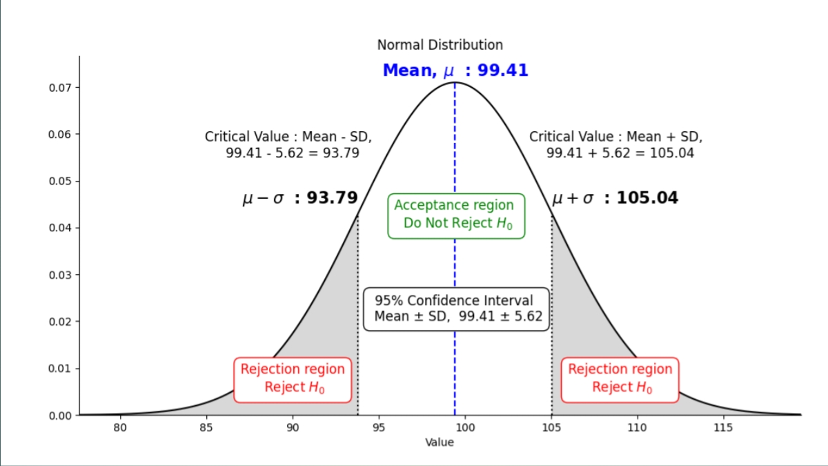
In the realm of statistics, the Z critical value for 95 confidence interval holds immense importance, serving as a cornerstone in hypothesis testing, confidence interval construction, and decision-making processes. This comprehensive guide will delve deep into the intricacies of the Z value for 95 confidence, its calculation, practical applications, and the underlying principles that govern its usage.

1. Introduction to Z Critical Value for 95 Confidence Interval

At its core, the 95 percent confidence interval critical value represents the number of standard deviations a data point deviates from the mean of a normal distribution. This fundamental concept underpins various statistical analyses, providing a standardized metric for assessing the significance of findings.

2. Understanding Confidence Intervals

Before delving into the specifics of the Z Critical Value for 95 Confidence Interval, it’s imperative to grasp the concept of confidence intervals. A confidence interval is a range of values within which an estimate is likely to fall. It provides a measure of certainty regarding the true value of a population parameter. Let’s explore different confidence intervals and their associated values.

Z Critical Value for 99% Confidence Interval

With a z critical value for 99% confidence interval, the z-value is approximately 2.576. This means that if the null hypothesis is true, the observed data point is 2.576 standard deviations away from the mean. The corresponding p-value is approximately 0.01, indicating a 1% chance of observing a result as extreme as the one obtained, assuming the null hypothesis is true.

Z Critical Value for 95% Confidence Interval

Z Critical Value for 95 Confidence Interval, the z-value is approximately 1.96. If the null hypothesis holds true, the observed data point is 1.96 standard deviations from the mean. The corresponding p-value is approximately 0.05, suggesting a 5% chance of observing a result as extreme as the one obtained, assuming the null hypothesis is true.

Z Critical Value for 90% Confidence Interval

For a z critical value for 90% confidence interval, the z-value is approximately 1.645. In this case, the observed data point is 1.645 standard deviations away from the mean, assuming the null hypothesis is true. The corresponding p-value is approximately 0.10, indicating a 10% chance of observing a result as extreme as the one obtained, assuming the null hypothesis is true.

Benefits of Confidence Intervals

Confidence intervals are crucial in statistical analysis as they provide a range of values that likely contain the true population parameter. This information helps researchers and decision-makers make informed choices, evaluate the reliability of their data, and conclude with a level of certainty.

3. Understanding P-Values

P-values are statistical measures used to determine the strength of evidence against a null hypothesis. They quantify the probability of obtaining results as extreme as those observed, assuming the null hypothesis is true.

Interpreting P-Values

The p-value associated with a confidence interval represents the likelihood of obtaining a result as extreme as the observed data point, assuming the null hypothesis is true. A decreased p-value suggests more compelling evidence for rejecting the null hypothesis.

4. Significance of Z Critical Value for 95% Confidence Interval

The choice of a 95 confidence interval critical value is rooted in statistical theory and practical considerations. A 95% confidence level implies that if we were to conduct the same experiment or sampling procedure multiple times, approximately 95% of the resulting confidence intervals would contain the true population parameter. This level of confidence strikes a balance between precision and reliability, making it a commonly used benchmark in statistical analysis.

5. Using Z Critical Value Tables

In practical applications, Z critical value tables serve as invaluable tools for determining critical values corresponding to different confidence levels and probabilities. These tables provide a quick reference for statisticians and researchers, facilitating the calculation of Z critical value with ease.

6. Z Critical Value for 95 Confidence Interval

The Z critical value of 1.96 for a 95% confidence interval is deeply ingrained in statistical practice. It signifies the boundary beyond which data points are considered statistically significant or lies within the confidence interval. Understanding this value is paramount for interpreting research findings, drawing conclusions, and making informed decisions based on sample data.

7. Importance in Statistical Analysis

The importance of the Z critical value cannot be overstated in statistical analysis. It forms the basis for hypothesis testing, where researchers assess the likelihood of observing a particular outcome under different scenarios. By comparing calculated test statistics with the Z critical value, researchers can determine the statistical significance of their results and make valid inferences about the underlying population.

8. Practical Examples

To illustrate the practical relevance of the Z critical value, consider a scenario where researchers are investigating the effectiveness of a new medical treatment. By calculating the Z critical value and comparing it with the observed treatment outcomes, researchers can ascertain whether the observed effects are statistically significant or merely due to chance.

9. Factors Influencing Z Critical Value

Several factors influence the Z critical value, including the desired confidence level, sample size, and the distribution of the data. Higher confidence levels require larger Z critical values, while larger sample sizes result in narrower confidence intervals and, consequently, smaller Z critical values.

10. Common Misconceptions

Despite its ubiquity in statistical practice, the concept of the Z critical value is often misunderstood. One common misconception is that the Z critical value remains constant across different sample sizes or confidence levels. In reality, the Z critical value varies depending on these factors and must be recalculated accordingly.

11. Tips for Efficient Calculation

Efficient calculation of the Z critical value is essential for streamlining statistical analyses and ensuring accuracy in results. Leveraging statistical software or online calculators can expedite the calculation process, particularly for complex analyses involving large datasets or multiple variables.

12. Advantages of Utilizing Z Critical Value

The utilization of the Z critical value confers several advantages in statistical analysis. By providing a standardized metric for assessing significance, the Z critical value facilitates comparability across studies, enhances reproducibility, and fosters a rigorous approach to data analysis.

13. Example analysis

sample data = (87.6, 89.9, 91.6, 94.4, 95.7, 97.4, 97.6, 98.1, 98.2, 99.4, 99.8, 100.0, 101.7, 101.8, 102.2, 104.3, 105.4, 106.7, 107.0, 109.5)

The confidence interval reveals that we are 95% confident that the true population mean falls between 96.89 and 101.94. This indicates the range within which we expect the population mean to lie.

The p-value, which stands at 1.0, it’s a measure obtained from the statistical test. In essence, this value suggests that if the null hypothesis were true (assuming no significant difference), the observed data or even more extreme data would have been obtained with a probability of 1.0. In simpler terms, this high p-value implies that there isn’t enough evidence to reject the null hypothesis.

The standard deviation, hovering around 5.62, gives us insights into the variability or dispersion within the dataset. It essentially measures how much the individual data points deviate from the mean, offering a glimpse into the overall spread of the data.

14. Conclusion

In conclusion, the Z critical value for a 95% confidence interval serves as a linchpin in statistical analysis, providing researchers with a standardized metric for assessing significance and drawing valid conclusions from sample data. By understanding its calculation, interpretation, and practical implications, researchers can navigate the complexities of statistical inference with confidence and precision.

15. FAQs

Q1: Can the Z critical value be negative? A1: No, the Z critical value represents the number of standard deviations from the mean and, therefore, cannot be negative.

Q2: How does the confidence level affect the Z critical value? A2: Higher confidence levels necessitate larger Z critical values to encompass a greater proportion of the standard normal distribution.

Q3: Is the Z critical value the same as the Z-score? A3: While related, the Z critical value refers specifically to the threshold used in hypothesis testing and confidence interval construction, whereas the Z-score represents the number of standard deviations a data point is from the mean.

Q4: Why is a 95% confidence level commonly used? A4: A 95% confidence level strikes a balance between precision and reliability, offering a high degree of confidence while maintaining manageable margins of error.

Q5: Are there alternatives to the Z critical value for hypothesis testing? A5: Yes, alternatives include the t-distribution, particularly in cases where the population standard deviation is unknown or sample sizes are small.

Read more

1. Sample of Null Hypothesis

2. How to Find P Value from t Statistic

3. How to Find Correlation Coefficient in R

4. Arima Forecasting Model

arima forecasting model

ARIMA Forecasting Model | Unlocking Future Trends with Time Series Analysis and Best Example Python Code
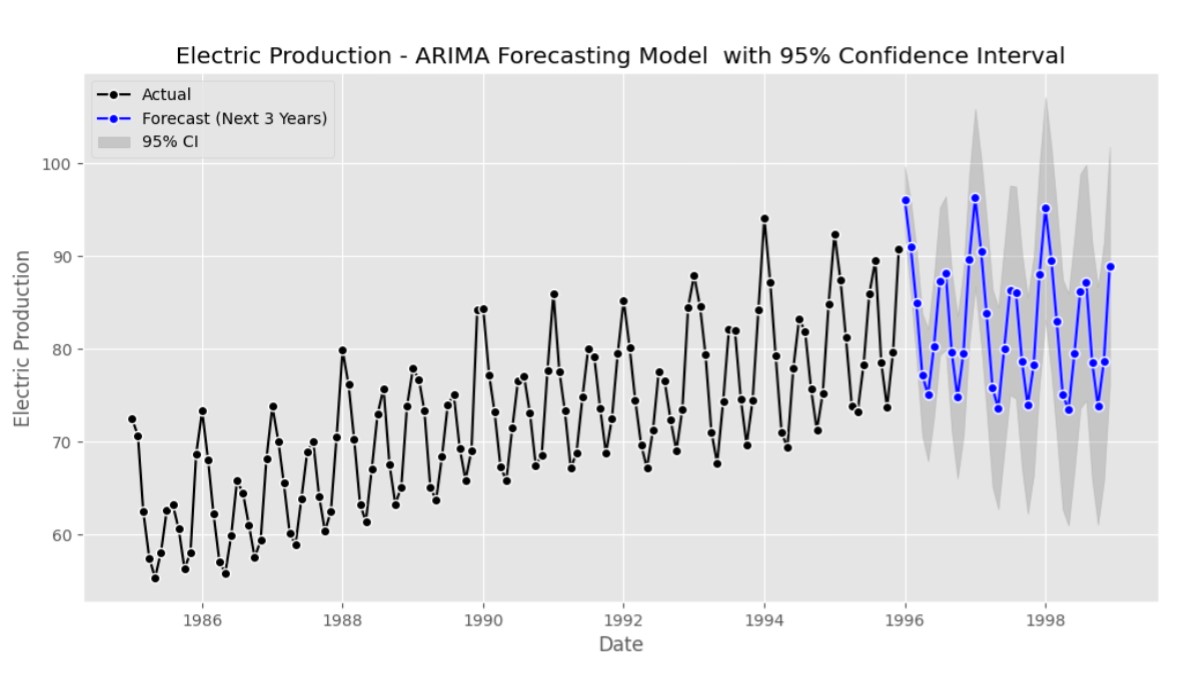
Introduction :

In the ever-changing landscape of data analytics, the ARIMA (AutoRegressive Integrated Moving Average) forecasting model emerges as a powerful tool for predicting future trends and patterns. As businesses strive to stay ahead in dynamic markets, leveraging the capabilities of ARIMA becomes vital for making informed decisions and gaining a competitive edge. In this comprehensive guide, we will delve deep into the intricacies of the ARIMA forecasting model, shedding light on its applications across various industries and its significance in time series analysis.

1. ARIMA Forecasting Model:

The ARIMA model, a statistical method for analyzing and forecasting time series data, combines three essential components: autoregression, differencing, and moving averages. By understanding the patterns and dependencies within the data, ARIMA enables accurate prediction of future values.

2. Understanding Time Series Analysis:

What is Time Series Data?
Time series data consists of observations collected sequentially over time. Analyzing time series data aims to uncover underlying patterns, trends, and seasonality to gain insights into the data’s behavior.

Importance of Time Series Analysis:
Time plays a crucial role in decision-making across industries. Time series analysis, especially utilizing the ARIMA forecasting model, allows us to analyze and exploit temporal patterns, aiding in more informed decision-making processes.

3. Basics of ARIMA Forecasting Model:

The ARIMA model comprises three main components:

a. Autoregressive (AR) Component:
The AR component represents the relationship between the current observation and a certain number of lagged observations from previous time steps, allowing us to capture dependencies within the data.

b. Integrated (I) Component:
The integrated component involves differencing the raw observations to achieve stationarity, ensuring that the mean, variance, and covariance remain constant over time.

c. Moving Average (MA) Component:
The MA component captures the relationship between the current observation and the residual errors derived from a moving average model applied to lagged observations.

4. Advantages of ARIMA Forecasting Model:

a. Flexibility to handle various types of time series data.
b. Ability to capture both linear and non-linear relationships.
c. Robustness against outliers and irregularities in the data.
d. Interpretability of model parameters.

5. Applications of ARIMA Forecasting Model:

ARIMA finds extensive applications across diverse domains, including:

a. Financial Forecasting:
ARIMA aids stock market analysis, risk management, and predicting financial market trends.

b. Demand Forecasting:
Retailers leverage ARIMA to forecast product demand, optimize inventory management, and enhance supply chain efficiency.

c. Weather Forecasting:
Meteorologists utilize ARIMA to predict weather patterns, such as rainfall, temperature, precipitation, and wind speed, based on historical climate data.

6. Steps to Build an ARIMA Forecasting Model:

a. Data Collection and Preprocessing:
Gather historical data relevant to the phenomenon under study and preprocess it to ensure consistency and quality.

b. Identifying Parameters (p, d, q):
Determine the optimal values for the three parameters of the ARIMA model: p (autoregressive order), d (degree of differencing), and q (moving average order).

c. Model Fitting and Evaluation:
Fit the ARIMA model to the training data and evaluate its performance using appropriate metrics such as Mean Absolute Error (MAE) or Root Mean Square Error (RMSE).

7. Tips for Improving ARIMA Forecasting Model Performance:

a. Incorporate exogenous variables, if available, to enhance predictive accuracy.
b. Experiment with different combinations of model parameters to find the best fit.
c. Regularly refresh the model with fresh data to adjust to evolving trends and patterns.

8. Comparison with Other Forecasting Techniques:

ARIMA is often compared with other forecasting methods such as Exponential Smoothing, Prophet, and Long Short-Term Memory (LSTM) networks, highlighting its strengths and limitations in different scenarios.

9. Challenges and Limitations of ARIMA Forecasting Model:

Despite its effectiveness, the ARIMA model has certain limitations, including its assumption of linearity, sensitivity to outliers, and the requirement of stationary data for accurate predictions.

With advancements in machine learning and artificial intelligence, researchers are exploring hybrid models that combine ARIMA with deep learning techniques to improve forecasting accuracy and robustness.

11. Conclusion:

The ARIMA forecasting model is a powerful tool for analyzing and predicting time series data across various domains. By understanding its principles, applications, and best practices, practitioners can leverage ARIMA to gain valuable insights and make informed decisions in a rapidly changing world.

12. Frequently Asked Questions:

a. Can ARIMA be used for short-term forecasting?
Yes, ARIMA is suitable for short-term forecasting, especially when there are clear patterns and trends in the underlying data.
b. What is the difference between ARIMA and SARIMA?
SARIMA (Seasonal ARIMA) extends the ARIMA forecasting model to account for seasonal patterns in the data, making it more suitable for time series with recurring seasonal variations.
c. How do you evaluate the performance of an ARIMA model?
Performance evaluation metrics like Mean Absolute Error (MAE), Mean Squared Error (MSE), and Root Mean Squared Error (RMSE) are commonly used to assess the accuracy of ARIMA forecasts.
d. Can ARIMA handle non-linear relationships in data?
While primarily designed for linear relationships, ARIMA can capture some degree of non-linearity depending on the complexity of the underlying data patterns.
e. Is it necessary for time series data to be stationary for the ARIMA forecasting model?
Yes, stationary data is necessary for accurate ARIMA forecasting, as it ensures that the statistical properties of the data remain constant over time.

13. Example code: ARIMA Forecasting Model (Python Code)

ARIMA Forecasting Model: sample Electric Production dataset download

966 B

Importing required libraries and data for ARIMA Forecasting Model analysis

# Importing required libraries 
import numpy as np 
import pandas as pd 
import matplotlib.pyplot as plt 
from statsmodels.tsa.seasonal import seasonal_decompose 

# Use the 'ggplot' style 
#plt.style.use('ggplot') 

Read the Electric_Production dataset

#Read the Electric_Production dataset 
Electric_Production = pd.read_csv('Electric_Production.csv', index_col ='date', parse_dates = True) 

#Print the first five rows of the dataset 
Electric_Production.head(5) 

Assuming ‘Electric_Production’, original time series, Trend, Seasonal, Residual component

from statsmodels.tsa.seasonal import seasonal_decompose
import matplotlib.pyplot as plt

# Assuming 'Electric_Production' is your original time series data
result = seasonal_decompose(Electric_Production['electric'], model='multiplicative')

# Plotting the ETS decomposition with custom colors
plt.figure(figsize=(12, 8))

# Original time series
plt.subplot(411)
plt.plot(Electric_Production['electric'], label='Original Time Series', color='black', linestyle='-',marker='o', markerfacecolor='black', markeredgecolor='white')
plt.legend(loc='upper left')
plt.grid(True, linestyle='--', alpha=0.7)

# Trend component
plt.subplot(412)
plt.plot(result.trend, label='Trend Component', color='black', linestyle='-',marker='o', markerfacecolor='black', markeredgecolor='white' )

plt.legend(loc='upper left')
plt.grid(True, linestyle='--', alpha=0.7)

# Seasonal component
plt.subplot(413)
plt.plot(result.seasonal, label='Seasonal Component', color='black', linestyle='-', marker='o', markerfacecolor='black', markeredgecolor='white')
plt.legend(loc='upper left')
plt.grid(True, linestyle='--', alpha=0.7)

# Residual component
plt.subplot(414)
plt.plot(result.resid, label='Residual Component', color='black', linestyle='-', marker='o', markerfacecolor='black', markeredgecolor='white')
plt.legend(loc='upper left')

# Add gridlines
plt.grid(True, linestyle='--', alpha=0.7)

# Adjust layout
plt.tight_layout()


# Display the plot
plt.show()
# Import the library 
from pmdarima import auto_arima 

# Ignore harmless warnings 
import warnings 
warnings.filterwarnings("ignore") 

Fit Auto ARIMA

stepwise_fit = auto_arima(Electric_Production,
                           start_p=1,  # Starting value of the autoregressive (AR) component
                           start_q=1,  # Starting value of the moving average (MA) component
                           max_p=3,    # Maximum value of the AR component
                           max_q=3,    # Maximum value of the MA component
                           m=12,       # Number of periods in each season (assuming monthly data)
                           start_P=0,  # Starting value of the seasonal AR component
                           seasonal=True,  # Indicates whether the data has a seasonal pattern
                           d=None,     # Order of differencing for the non-seasonal component (automatically determined)
                           D=1,        # Order of differencing for the seasonal component
                           trace=True,  # Prints debugging information during the fitting process
                           error_action='ignore',  # Determines how errors during fitting are handled
                           suppress_warnings=True,  # Suppresses convergence warnings
                           stepwise=True  # Uses a stepwise approach for model selection
                           )
Summary of SARIMAX Results
# To print the summary 
stepwise_fit.summary() 
Split, train / test data
# Split data into train / test sets 
train = Electric_Production.iloc[:len(Electric_Production)-12] 
test = Electric_Production.iloc[len(Electric_Production)-12:] # set one year(12 months) for testing 

# Fit a SARIMAX(0, 1, 1)x(2, 1, 1, 12) on the training set 
from statsmodels.tsa.statespace.sarimax import SARIMAX 

model = SARIMAX(train['electric'], 
				order = (1, 0, 0), 
				seasonal_order =(2, 1, 1, 12)) 

result = model.fit() 
result.summary() 
Generate diagnostic plots
# Generate diagnostic plots
result.plot_diagnostics(figsize=(12, 8))

# Save the plot to a file

plt.show()

Predictions for one year against the test set

start = len(train) 
end = len(train) + len(test) - 1

# Predictions for one-year against the test set 
predictions = result.predict(start, end, typ = 'levels').rename("Predictions") 

# Visualize predictions vs actual values
plt.figure(figsize=(10, 6))

plt.plot(test['electric'], label='Actual Values', color='black', linestyle='-', 
         marker='o', markerfacecolor='black', markeredgecolor='white')

plt.plot(predictions, label='Predictions', color='blue', linestyle='--', 
         marker='o', markerfacecolor='blue', markeredgecolor='white')

plt.title('ARIMA forecasting Model: Actual vs Predicted')
plt.xlabel('Date')
plt.ylabel('Electric Production')
plt.legend(loc='upper right') # upper left

plt.savefig('arima forecasting model - actual vs predicted.png')
plt.show()

Assuming ‘test’ is your actual values and ‘predictions’ is the predicted values

Calculate evaluation metrics

Display the evaluation metrics

# Assuming 'test' is your actual values and 'predictions' is the predicted values
from sklearn.metrics import mean_absolute_error, mean_squared_error
import numpy as np
import matplotlib.pyplot as plt
from statsmodels.tsa.stattools import acf, pacf
from statsmodels.graphics.tsaplots import plot_acf, plot_pacf

# Calculate evaluation metrics
mae = mean_absolute_error(test['electric'], predictions)
mse = mean_squared_error(test['electric'], predictions)
rmse = np.sqrt(mse)

# Display the evaluation metrics
print(f'Mean Absolute Error (MAE): {mae:.2f}')
print(f'Mean Squared Error (MSE): {mse:.2f}')
print(f'Root Mean Squared Error (RMSE): {rmse:.2f}')

Train the model on the full dataset

# Train the model on the full dataset 
model = model = SARIMAX(Electric_Production['electric'], 
						order = (1, 0, 0), 
						seasonal_order =(2, 1, 1, 12)) 
result = model.fit() 
Forecast for the next 3 years
# Forecast for the next 3 years 
forecast = result.predict(start = len(Electric_Production), 
						end = (len(Electric_Production)-1) + 3 * 12, 
						typ = 'levels').rename('Forecast') 
print(forecast)

Arima forecasting values and confidence intervals

# Train the model on the full dataset
model = SARIMAX(Electric_Production['electric'], 
                order=(1, 0, 0), 
                seasonal_order=(2, 1, 1, 12))
result = model.fit()

# Forecast for the next 3 years
forecast = result.get_forecast(steps= 3 * 12)  # Forecast for the next 1 or 3 years 0r 5 years

# Extracting forecasted values and confidence intervals
forecast_values = forecast.predicted_mean.rename('Forecast')
ci_values = forecast.conf_int(alpha=0.05)  # 95% confidence interval

# Creating a DataFrame with forecast values and confidence intervals
forecast_df = pd.concat([forecast_values, ci_values], axis=1)
# Display the DataFrame
print(forecast_df)
Electric Production – ARIMA Forecasting Model with 95% Confidence Interval
# Plotting the actual values, forecast, and confidence interval
plt.figure(figsize=(12, 6))

# Plot actual values
plt.plot(Electric_Production['electric'], label='Actual', color='blue')

# Plot forecast
plt.plot(forecast_values.index, forecast_values.values, label='Forecast', color='orange')

# Plot confidence interval
plt.fill_between(ci_values.index, ci_values.iloc[:, 0], ci_values.iloc[:, 1], color='orange', alpha=0.2, label='95% CI')

# Set plot labels and title
plt.title( 'Electric Production - ARIMA Forecasting Model  with 95% Confidence Interval')
plt.xlabel('Date')
plt.ylabel('Electric Production')

# Customize legend
plt.legend(loc='upper left')

# Show the plot
plt.show()
Full detailed plot – Electric Production – ARIMA Forecasting Model with 95% Confidence Interval
# Plotting the actual values, forecast, and confidence interval
plt.figure(figsize=(12, 6))

# Plot actual values
plt.plot(Electric_Production['electric'], label='Actual', color='black', linestyle='-', marker='o', markerfacecolor='black', markeredgecolor='white')

# Plot forecast
plt.plot(forecast_values.index, forecast_values.values, 
         label='Forecast ( Next 3 Years)', color='green', linestyle='-', marker='o', markerfacecolor='green', markeredgecolor='white')

# Plot confidence interval
plt.fill_between(ci_values.index, ci_values.iloc[:, 0], ci_values.iloc[:, 1], color='gray', alpha=0.3, label='95% CI')

# Set plot labels and title
plt.title( 'Electric Production - ARIMA Forecasting Model  with 95% Confidence Interval')
plt.xlabel('Date')
plt.ylabel('Electric Production')

# Customize legend
plt.legend(loc='upper left')
plt.savefig('arima forecasting model_2.png')
# Show the plot
plt.show()

ARIMA forecasting model and having a solid understanding of time series analysis, businesses can harness the power of data analytics to predict future trends and gain a competitive advantage.

data analysis

The Power of Data Analysis: Unveiling Positive Insights through Simple Example1
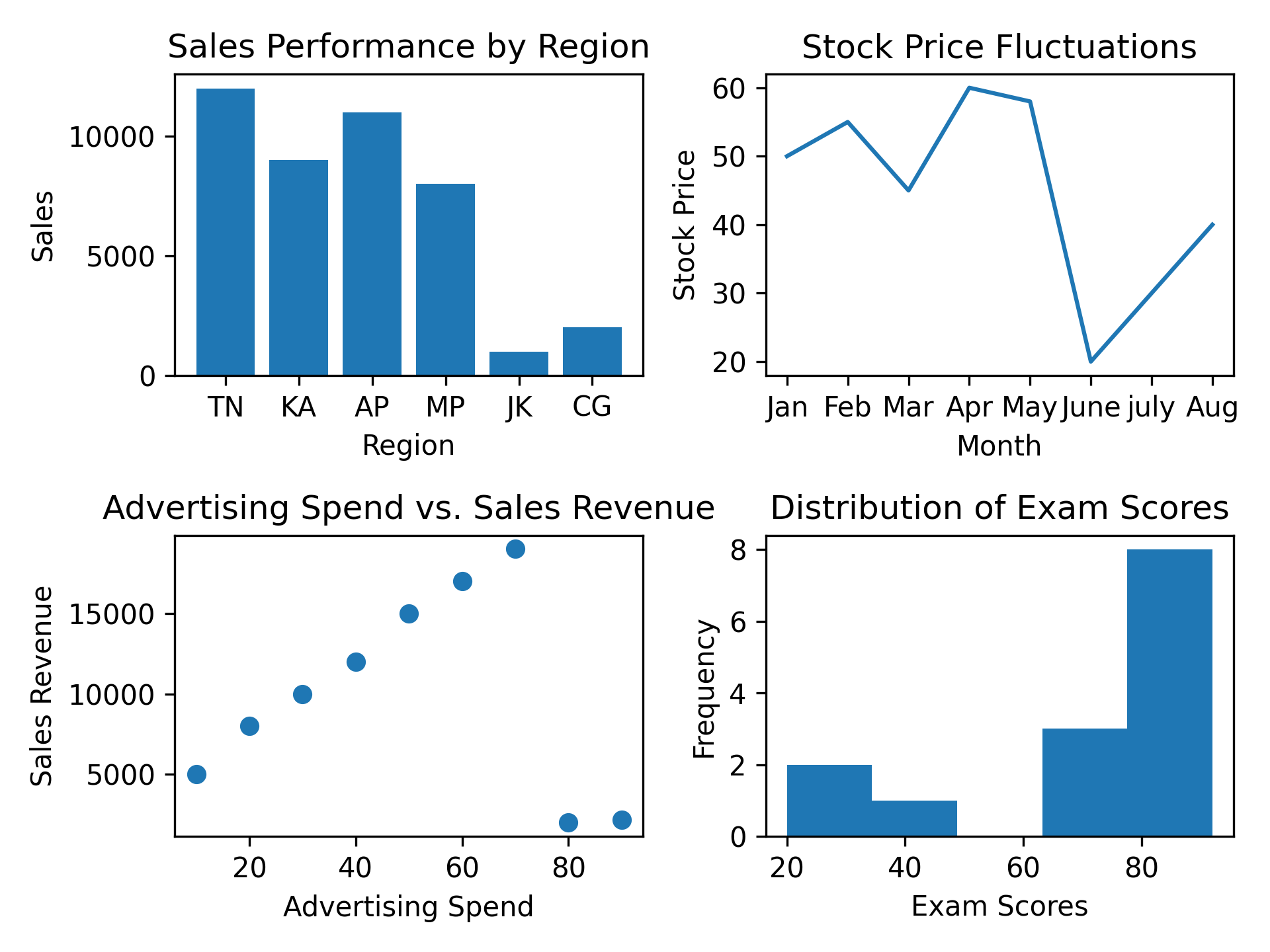
Data analysis is a crucial process that involves inspecting, cleaning, transforming, and modeling data to discover meaningful patterns, draw conclusions, and support decision-making. In today’s data-driven world, data analysis plays a vital role across various industries and domains, enabling businesses to gain valuable insights and make informed decisions. This article aims to provide a comprehensive overview of data analysis, its significance, and simple examples to illustrate its practical application.

1. Introduction to Data Analysis

Data analysis entails examining, purifying, modifying, and structuring data to unearth significant patterns and valuable insights. It involves applying statistical and logical techniques to uncover trends, relationships, and correlations within datasets. Data analysis can be performed using various tools and techniques, ranging from basic statistical calculations to advanced machine-learning algorithms.

2. Importance of Data Analysis

Data analysis is essential for businesses and organizations as it provides valuable insights and helps in making informed decisions. By analyzing data, businesses can:

– Identify market trends and consumer preferences

– Optimize operational processes

– Improve decision-making and strategic planning

– Enhance product development and innovation

– Identify potential risks and opportunities

– Measure the effectiveness of marketing campaigns

– Enhance customer satisfaction and retention

3. Steps in Data Analysis

Effective data analysis involves several key steps:

3.1 Data Collection

Gathering pertinent data from diverse sources marks the initial phase of the data analysis process. This can include structured data from databases, spreadsheets, or online sources, as well as unstructured data from social media, emails, or text documents.

3.2 Data Cleaning

Data cleaning involves removing errors, inconsistencies, and duplications from the dataset. This step ensures that the data is accurate and reliable for further analysis.

 3.3 Data Transformation

Data transformation encompasses the conversion of unprocessed data into a format that is well-suited for analytical purposes. This may include aggregating data, creating new variables, or normalizing data to ensure consistency and compatibility.

3.4 Data Modeling

Data modeling involves applying statistical techniques and algorithms to analyze the dataset. This step helps in uncovering patterns, relationships, and correlations within the data, enabling deeper insights and predictions.

3.5 Data Visualization

Data visualization is the process of presenting data in visual formats such as charts, graphs, or maps. Visual representations make it easier to understand complex data and communicate insights effectively.

4. Examples of Data Analysis

Data analysis has diverse applications across various industries. Here are a few simple examples that illustrate its practical use:

4.1 Sales Analysis

Retail companies can analyze sales data to identify top-selling products, peak sales periods, and customer buying patterns. This information helps in optimizing inventory management, pricing strategies, and marketing campaigns.

4.2 Customer Segmentation

By analyzing customer data, businesses can segment their customer base into distinct groups based on demographics, behaviors, or preferences. This enables targeted marketing, personalized recommendations, and improved customer experiences.

4.3 Sentiment Analysis

Sentiment analysis involves analyzing text data, such as customer reviews or social media comments, to determine the sentiment or opinion expressed. This helps businesses gauge customer satisfaction, identify emerging trends, and manage brand reputation.

4.4 Financial Forecasting

Financial institutions can use historical financial data and economic indicators to forecast future trends and make informed investment decisions. Data analysis techniques like time series analysis and regression models aid in predicting market movements.

4.5 Website Traffic Analysis

Analyzing website traffic data provides insights into visitor behavior, referral sources, and conversion rates. This information helps businesses optimize their website design, content, and marketing strategies to drive more traffic and improve user experience.

5. Tools and Techniques for Data Analysis

Numerous tools and techniques are available for data analysis, catering to different levels of complexity and expertise. Some commonly used tools include:

– Microsoft Excel: A versatile spreadsheet program with built-in data analysis features.

– Python: A popular programming language with libraries like Pandas, NumPy, and SciPy for data analysis and manipulation.

– R: A statistical programming language widely used for data analysis and visualization.

– Tableau: A powerful data visualization tool that helps create interactive dashboards and reports.

– SQL: A language for managing and analyzing structured data in relational databases.

6. Challenges in Data Analysis

Engaging in data analysis presents a distinct array of obstacles and hurdles to overcome. Some common challenges include:

– Engaging in data analysis presents a distinct array of obstacles and hurdles to overcome. Engaging in data analysis presents a distinct array of obstacles and hurdles to overcome.

– Dealing with missing or incomplete data

– Data privacy and security concerns

– Deriving meaningful observations from extensive and intricate datasets.

– Choosing the appropriate analysis techniques and models

– Interpreting and communicating the results effectively

Despite these challenges, effective data analysis can lead to valuable insights and a competitive advantage for businesses.

7. Conclusion

Data analysis is a powerful process that enables businesses to uncover patterns, gain insights, and make informed decisions. By collecting, cleaning, transforming, modeling, and visualizing data, organizations can derive valuable information that drives growth, innovation, and success. Whether it’s sales analysis, customer segmentation, sentiment analysis, or financial forecasting, data analysis plays a vital role in various industries. Embracing data analysis tools, techniques, and best practices can empower businesses to thrive in today’s data-driven world.

 8. FAQs

1. Q: What is the role of data analysis in decision-making?

   A: Data analysis provides insights that support informed decision-making by identifying trends, patterns, and correlations within datasets.

2. Q: Which industries benefit from data analysis?

   A: Data analysis is beneficial across industries, including retail, finance, healthcare, marketing, and many others.

3. Q: How can data analysis enhance customer satisfaction?

   A: By analyzing customer data, businesses can personalize experiences, offer targeted recommendations, and improve overall customer satisfaction.

4. Q: What are some common challenges in data analysis?

  A: Data quality, missing data, privacy concerns, interpreting results, and handling large datasets are common challenges in data analysis.

5. Q:Can data analysis help predict future trends?

   – A: Data analysis techniques like forecasting and regression models can help predict future trends based on historical data.

9. Data analysis Plots

The practice of data analysis involves the examination, purification, conversion, and modeling of data to unveil significant patterns and valuable insights. It involves applying statistical and logical techniques to uncover trends, relationships, and correlations within datasets. Here are five common types of plots that can be used in data analysis:

1. Line Plot:

   A line plot is useful for visualizing trends over time or sequential data. For example, it can be used to plot stock prices over a period or to show the temperature variation throughout the day.

2. Bar Plot:

   A bar plot is effective for comparing categories or displaying frequencies. It can be used to compare sales figures of different products or to show the distribution of votes for multiple candidates in an election.

3. Scatter Plot:

   A scatter plot is used to investigate the relationship between two continuous variables. It can help identify correlations or patterns in the data. For example, it can be used to analyze the relationship between age and income or to examine the association between advertising expenditure and sales.

4. Histogram:

   A histogram is used to visualize the distribution of a single variable. It divides the data into bins and shows the frequency or count of data points within each bin. Histograms are commonly used to analyze data such as exam scores or customer ages to understand the underlying distribution.

5. Pie Chart:

   A pie chart is suitable for displaying the composition or proportion of different categories. It is often used to represent market share, budget allocation, or the distribution of a population across different groups.

These plots, along with various other types available in data analysis libraries like Matplotlib or Seaborn in Python, provide visual representations that aid in understanding and interpreting data. They help in identifying patterns, outliers, and relationships within datasets, making data analysis more accessible and insightful.